The new version of CoreUI is available. Please check the latest version.
Introduction
CoreUI is the fastest way to build a modern dashboard for any platforms, browser, or device. A complete Dashboard UI Kit that allows you to quickly build eye-catching, high-quality, high-performance responsive applications.
On this page:
Quickstart
There are two easy ways to use CoreUI. You can add our components library to your project or use our fully-featured admin template.
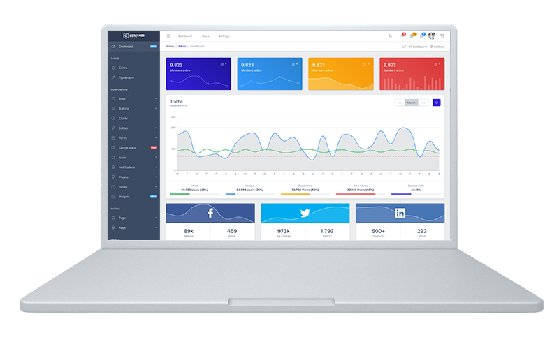
CoreUI Admin Template
The fastest way to start using CoreUI is to download our ready to use admin template.
Installation
git clone https://github.com/coreui/free-bootstrap-admin-template.git my-project
# clone the repo

$ cd my-project
# go into app's directory

$ npm install
# install app's dependencies
Usage
npm run serve
# serve with hot reload at localhost:3000.

$ npm run build
# build for production with minification
CoreUI UI Components Library
Looking to quickly add CoreUI to your project? Use our CDN. Using a package manager or need to download the source files? Head to the downloads page.
CSS
Copy and paste the stylesheet <link> into your <head> before all other stylesheets to load our CSS.
Several of our components need the use of JavaScript to function. Specifically, they need our JavaScript plugins and Popper.js. Put the following <script>s near the end of your pages, right before the closing </body> tag, to let them work. Popper.js need come first, and later our JavaScript plugins.
Curious about which components explicitly require our JavaScript and Popper.js? Click the show components link below. If you’re at all unsure about the general page structure, keep reading for an example page template.
Our coreui.bundle.js and coreui.bundle.min.js include Popper. For more information about what’s included in CoreUI, please see our contents section.
Show components requiring JavaScript
Alerts for dismissing
Buttons for toggling states and checkbox/radio functionality
Carousel for all slide behaviors, controls, and indicators
Class Toggler for changing CSS classes
Collapse for toggling visibility of content
Dropdowns for displaying and positioning (also requires Popper.js)
Modals for displaying, positioning, and scroll behavior
Navbar for extending our Collapse plugin to implement responsive behavior
Tooltips and popovers for displaying and positioning (also requires Popper.js)
Scrollspy for scroll behavior and navigation updates
Sidebar for adding active class and for displaying dropdowns
Starter template
Be sure to have your pages set up with the latest design and development standards. That means using an HTML5 doctype and including a viewport meta tag for proper responsive behaviors. Put it all together and your pages should look like this:
<!doctype html><htmllang="en"><head><!-- Required meta tags --><metacharset="utf-8"><metaname="viewport"content="width=device-width, initial-scale=1"><!-- CoreUI CSS --><linkrel="stylesheet"href="https://unpkg.com/@coreui/coreui/dist/css/coreui.min.css"crossorigin="anonymous"><title>CoreUI</title></head><bodyclass="c-app"><h1>Hello, world!</h1><!-- Optional JavaScript --><!-- Popper.js first, then CoreUI JS --><scriptsrc="https://unpkg.com/@popperjs/core@2"></script><scriptsrc="https://unpkg.com/@coreui/coreui/dist/js/coreui.min.js"></script></body></html>
That’s all you need for overall page requirements. Visit the Layout docs to start laying out your site’s content and components.
Important globals
CoreUI employs a handful of essential global styles and settings that you’ll need to be aware of when using it, all of which are almost exclusively geared towards the normalization of cross-browser styles. Let’s dive in.
HTML5 doctype
CoreUI requires the use of the HTML5 doctype. Without it, you’ll see some funky incomplete styling, but including it shouldn’t cause any considerable hiccups.
<!doctype html><htmllang="en">
...
</html>
Right-to-left (RTL) Support
All CoreUI components, plugins, and layouts support RTL out of the box. Enabling RTL for your website is quite simple, please add dir="rtl" to the <html> tag each time the overall document direction is right-to-left. This sets the base direction for the entire document
The dir attribute is used to set the base direction of text for display. It is essential for enabling HTML in right-to-left scripts such as Arabic, Hebrew, Syriac, and Thaana. Numerous different languages are written with these scripts, including Arabic, Hebrew, Pashto, Persian, Sindhi, Syriac, Dhivehi, Urdu, Yiddish, etc.
<htmldir="rtl"lang="..">
...
</html>
Responsive meta tag
CoreUI is developed mobile-first, a strategy in which we optimize code for mobile devices first and then scale up components as necessary using CSS media queries. To ensure proper rendering and touch zooming for all devices, add the responsive viewport meta tag to your <head>.
You can see an example of this in action in the starter template.
Box-sizing
For more straightforward sizing in CSS, we switch the global box-sizing value from content-box to border-box. This ensures padding does not affect the final computed width of an element, but it can cause problems with some third party software like Google Maps and Google Custom Search Engine.
On the rare occasion you need to override it, use something like the following:
With the above snippet, nested elements—including generated content via ::before and ::after—will all inherit the specified box-sizing for that .selector-for-some-widget.
For improved cross-browser rendering, we use Reboot to correct inconsistencies across browsers and devices while providing slightly more opinionated resets to common HTML elements.
Community
Stay up to date on the development of CoreUI and reach out to the community with these helpful resources.