UI Components For Bootstrap — Part 1 by Mehwash Patel
 Łukasz Holeczek
Follow Łukasz Holeczek on GitHub
Connect with Łukasz Holeczek on LinkedIn
Follow Łukasz Holeczek on X (Twitter)
Łukasz Holeczek
Follow Łukasz Holeczek on GitHub
Connect with Łukasz Holeczek on LinkedIn
Follow Łukasz Holeczek on X (Twitter)
CoreUI is a complete Dashboard UI Kit that allows you to quickly build UX friendly, responsive applications.
I’ll be writing about various Bootstrap components in detail in this series. Comment below if you’ve any questions or if you’d want me to write about a specific CoreUI component.
In Part 1 of this series, we’ll look at the components: Alert, Badge and Toast.
So without further ado, let’s get started.
Alert component is used to display message to the user. CoreUI’s Bootstrap alert component comes with a bunch of usable settings to make it more user friendly.
Speed up your responsive apps and websites with fully-featured, ready-to-use open-source admin panel templates—free to use and built for efficiency.


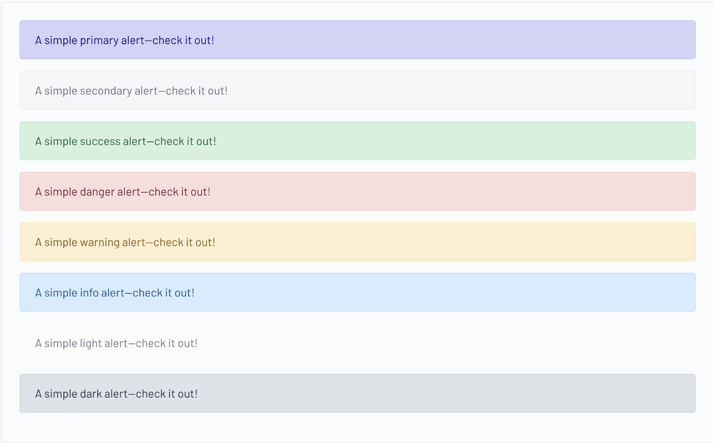
To create an alert box, inside a div element use class .alert followed by one of the eight contextual classes: .alert-primary, .alert-secondary, .alert-success, .alert-danger, .alert-warning, .alert-info, .alert-light, .alert-dark
Example:
<div class="alert alert-primary">
   A simple primary alert-check it out!
</div>
If you’re using a link inside the alert message and don’t want the link text colour to be the default blue use .alert-link class inside the anchor tag. The .alert-link utility class will use matching colour as the contextual class.

<div class="alert alert-primary" role="alert">
   A simple primary alert with <a href="#" class="alert-link">an example link</a>. Give it a click if you like.
</div>
Just like anchor tag you can incorporate other HTML elements as well such as <h1>, <p>, <hr> etc. within an alert component.
Sometimes we may want to add an alert box with a close button on it. To do that first make sure you’ve included the CoreUI javascript plugin. Add .alert-dismissible class to the main div, this will add the required styling for the close button. Then add <button> element with .close class, also add data-dismiss=”alert” attribute to the button element.

<div class="alert alert-warning alert-dismissible" role="alert">
<strong>Holy guacamole!</strong> You should check in on some of those fields below.
<button type="button" class="close" data-dismiss="alert" aria-label="Close">
<span aria-hidden="true">×</span>
</button>
</div>
More information on CoreUI alert component and JS events related to the component can be found here: https://coreui.io/docs/components/bootstrap/alerts/
Badges are small count and labelling component. CoreUI’s Bootstrap badge component uses font sizing and em units relative to the parents component.
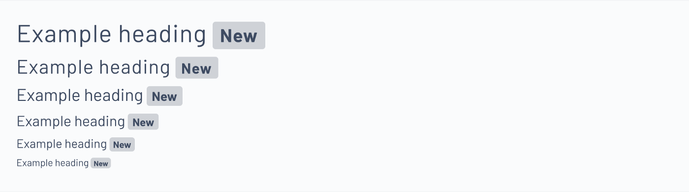
To create a badge inside a parent component, use element with .badge class followed by one of the eight contextual classes: .bg-primary, .bg-secondary, .bg-success, .bg-danger, .bg-warning, .bg-info, .bg-light, .bg-dark
<h1>Example heading <span class="badge bg-secondary">New</span></h1>
<h2>Example heading <span class="badge bg-secondary">New</span></h2>
<h3>Example heading <span class="badge bg-secondary">New</span></h3>
<h4>Example heading <span class="badge bg-secondary">New</span></h4>
<h5>Example heading <span class="badge bg-secondary">New</span></h5>
<h6>Example heading <span class="badge bg-secondary">New</span></h6>
To change the shape of badge from rectangle to a pill shape use .badge-pill modifier class.
More information on CoreUI badge component can be found here: https://coreui.io/docs/components/bootstrap/badge/
Similar to alert box, toast component is used to show message to the user. The message then disappears after a couple of seconds or when a user action occurs.
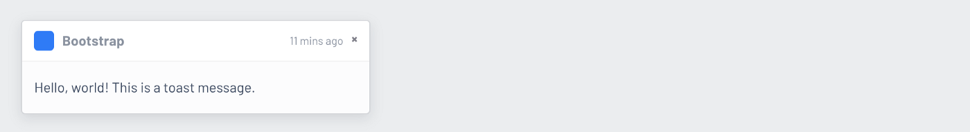
To create a toast, inside a div element use class .toast followed by nested div elements with .toast-header and .toast-body class respectively.
<div class="toast" role="alert" aria-live="assertive" aria-atomic="true">
<div class="toast-header">
<svg class="bd-placeholder-img rounded mr-2" width="20" height="20" xmlns="http://www.w3.org/2000/svg" preserveAspectRatio="xMidYMid slice" role="img"><rect width="100%" height="100%" fill="#007aff"/></svg> <strong class="mr-auto">Bootstrap</strong>
<small>11 mins ago</small>
<button type="button" class="ml-2 mb-1 close" data-dismiss="toast" aria-label="Close">
<span aria-hidden="true">×</span>
</button>
</div>
<div class="toast-body">
Hello, world! This is a toast message.
</div>
</div>
For this to work, you need to initialize toast with Javascript.
var toastElList = \[\].slice.call(document.querySelectorAll('.toast'))
var toastList = toastElList.map(function (toastEl) {
  return new coreui.Toast(toastEl, option)
})
Multiple toasts will appear as default vertically stacked on the UI.
autohide: false will add a close button to the toast. If autohide: false is not present than toast will automatically hide/disappear.
More on CoreUI’s toast methods and events can be found here: https://coreui.io/docs/components/bootstrap/toasts/
PS Stay tuned, in part 2 of the series we’ll go over the table component.
PS2 Text originally posted by one and only Mehwash Patel https://mehwash-patel90.medium.com/
