How to Use Bootstrap Modal in Vue 3 – Clean Integration with CoreUI

Modals are essential in modern interfaces, whether you’re confirming destructive actions, displaying forms, or showing dynamic content. If you’re using Vue 3 with Bootstrap styles, you might wonder: what’s the cleanest and most idiomatic way to use a modal?
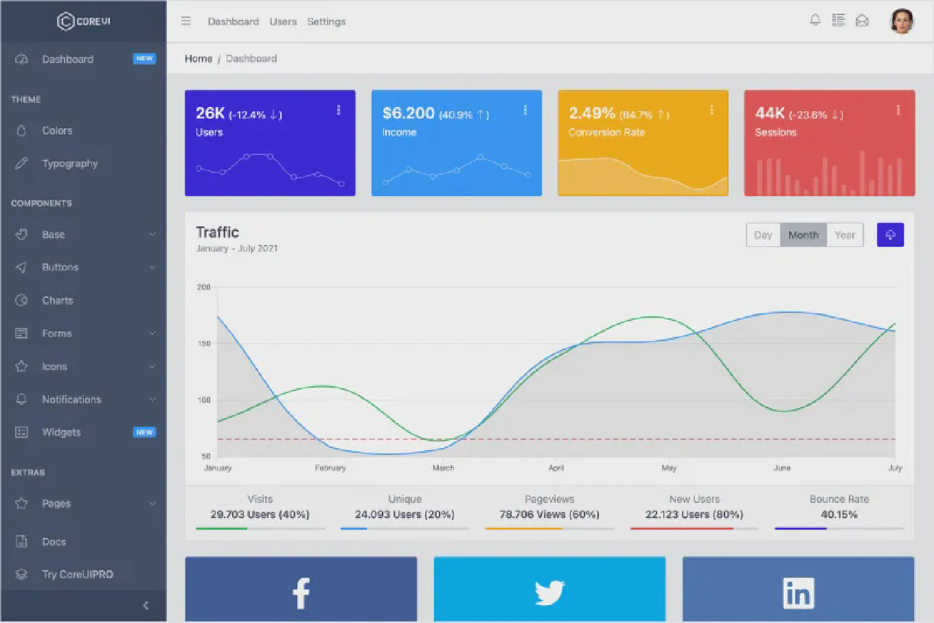
Speed up your responsive apps and websites with fully-featured, ready-to-use open-source admin panel templates—free to use and built for efficiency.
In this guide, you’ll learn how to implement a Bootstrap-style modal in Vue 3 using CModal from CoreUI for Vue — declaratively, accessibly, and with full control over behavior and styling.
👤 Who is this for?
You’ll benefit from this article if:
- You’re building a Vue 3 app styled with Bootstrap 5 or CoreUI.
- You want a declarative, reactive modal component.
- You care about keyboard accessibility, mobile UX, and SSR compatibility.
- You’re looking for a ready-to-use modal that just works, with no imperative DOM hacks.
🧨 Why Bootstrap’s Native Modal Is Not Vue-Friendly
Bootstrap’s own modal JS API requires you to manually instantiate and control modals through the DOM:
const modal = new bootstrap.Modal(document.getElementById('modal'))
modal.show()
That doesn’t work well in Vue, which favors declarative templates, reactive state, and lifecycle-aware components. You risk:
- DOM mismatches,
- memory leaks,
- broken behavior on re-renders or SSR.
✅ Use CModal – The Vue Way
With CModal from CoreUI for Vue, you get:
- Full Bootstrap 5 styling out of the box,
- Controlled visibility through Vue’s reactivity system,
- Built-in support for ESC key, backdrop, and focus trap,
- Clean syntax with
visibleprop and@closeevent, - Seamless SSR/Nuxt compatibility.
⚙️ Example: Modal With Form Content
<template>
  <div>
    <CButton color="primary" @click="showModal = true">
      Open Modal
    </CButton>

    <CModal :visible="showModal" @close="showModal = false">
      <CModalHeader>
        <CModalTitle>Add New Item</CModalTitle>
      </CModalHeader>
      <CModalBody>
        <CFormInput label="Item Name" />
        <CFormInput label="Price" type="number" class="mt-2" />
      </CModalBody>
      <CModalFooter>
        <CButton color="secondary" @click="showModal = false">Cancel</CButton>
        <CButton color="primary">Save</CButton>
      </CModalFooter>
    </CModal>
  </div>
</template>

<script setup>
import {
  CModal,
  CModalHeader,
  CModalTitle,
  CModalBody,
  CModalFooter,
  CButton,
  CFormInput
} from '@coreui/vue'
import { ref } from 'vue'

const showModal = ref(false)
</script>
🧪 Features You Get by Default
| Feature | ✅ Included |
|---|---|
| Bootstrap 5+ styling | ✅ |
| Declarative control | ✅ |
| ESC key & focus trap | ✅ |
| ARIA attributes | ✅ |
| Fullscreen, centered, scrollable options | ✅ |
| SSR/Nuxt 3 compatibility | ✅ |
🔄 Optional Enhancements
You can enhance behavior with these props:
scrollable: allow body scroll inside modalfullscreen: make the modal cover the full screencentered: vertically center the modalsize="lg"/"sm": control modal width
<CModal :visible="showModal" centered scrollable size="lg">
❓ FAQ
Can I use this in Nuxt 3?
Yes — CoreUI components work in SSR setups.
Does it include fade transitions and keyboard support?
Yes — Bootstrap-style fade animations and ESC key handling are built in.
Can I nest other components inside the modal?
Absolutely — modals accept any slot content.
➕ Learn More
- 📘 CModal Documentation (Vue)
- 💻 Try the Vue Admin Templates
- 🧑💻 Browse CoreUI on GitHub
Build better UI dialogs in Vue with the power of Bootstrap styling and Vue 3 reactivity — no DOM hacks, no boilerplate, just clean logic.


