Top React UI Component Libraries in 2023
 Łukasz Holeczek
Follow Łukasz Holeczek on GitHub
Connect with Łukasz Holeczek on LinkedIn
Follow Łukasz Holeczek on X (Twitter)
Łukasz Holeczek
Follow Łukasz Holeczek on GitHub
Connect with Łukasz Holeczek on LinkedIn
Follow Łukasz Holeczek on X (Twitter)
Developers are consistently looking for the best tools for their projects. Numerous front-end developers agree that using a popular framework will keep the code simple and strong. This is why numerous programmers are now using the React UI Framework - a top-notch framework that offers excellent runtime performance for modern UIs.
This makes it an ideal option for constructing components that are of the highest quality, can be used multiple times and are able to handle large numbers of requests and renderings.
React allows you to create user interfaces that adjust to different platforms and browsers because it divides its data layer from the presentation logic. The React UI framework and component libraries are essential to JavaScript and make it possible to create customized user experiences.
This article is about the most beneficial React Component Libraries available in 2023, so let’s dive in.
Speed up your responsive apps and websites with fully-featured, ready-to-use open-source admin panel templates—free to use and built for efficiency.


Why React?
To answer that, we could just use this table and say – it’s obvious:
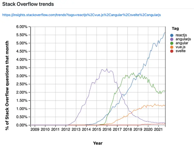
But the reality is never black and white… React is by far the most popular front-end framework/library and continues to grow faster. But there’s a “but” [did you notice, that there’s always a “but”?] Like React is more loved and “wanted” than other front-end frameworks but the satisfaction tends to decrease with popularity. True?
What is React?
CoreUI loves open source, so there’s no wonder then, that React is an open-source JavaScript library both for the web as well as mobile apps. It combines conveniently with other JavaScript frameworks and libraries. And most of all, it contains tiny, standalone bits of code called components. Like e.g. you know CoreUI’s React Dasboards for years, but React UI components were always something you’ve been asking us to code. And so we did it: https://coreui.io/react/demo/4.0/free/#/dashboard
What Are React UI Component Libraries?
React UI component libraries are resources containing a variety of pre-built, reusable components intended for React, the popular JavaScript library for constructing user interfaces. These libraries contain a vast array of UI components, from elementary elements such as buttons, inputs, and icons, to more intricate components such as navigation menus, data grids, and forms. They are developed to make the process of making user interfaces simpler by providing a set of verified, working components that could be quickly integrated into an application.
Developers can save both time and energy when utilizing React UI component libraries. As opposed to constructing each element from the ground up, they can just import the necessary parts, configure them with the desired attributes, and use them to create the UI. Not only does this expedite development, but also guarantees that components are uniform and well-crafted across the application.
Maintaining the visual consistency of an application over extended periods of time is eased with React UI component libraries. These libraries can include styles and themes that can be applied to components, allowing for a quick updating of the whole application’s appearance with a few changes. For further customization, some libraries also provide tools to modify the look and feel to meet the developer’s requirements.
UI libraries can be very helpful for boosting the accessibility of an app. Many libraries carry components that have been built to meet the Web Content Accessibility Guidelines (WCAG). These components make sure that users with disabilities can use the application, which is vital for fulfilling legal requirements and for making the app more welcoming to everyone.
When it comes to React UI component libraries, there is a wide selection available, from small sets of basic components to expansive libraries with hundreds of components. Some of the more popular libraries are Ant Design, Material-UI, and Semantic UI React. The best library to use depends on the particular project requirements, such as the desired style, the amount of components necessary, and the amount of customization that needs to be done.
React UI components may be combined with a variety of other libraries and tools, like Redux and MobX for state management, and styled-components and emotion for design systems. This gives developers the opportunity to create intricate, feature-rich applications all while still taking full advantage of the advantages of a component library.
To conclude, React UI component libraries are a necessary utility for forming high-quality user interfaces in React. By furnishing pre-manufactured, reusable components, they ease the development process, guarantee uniformity, increase accessibility and provide a basis for constructing more intricate applications. Whether constructing a straightforward website or a complicated web application, a React UI component library is a beneficial asset for any React developer.
Sexy (Best?) React UI Component Libraries
The nice thing about components is that they’re modular even without many app-specific dependencies. So no one can stop you to reuse the components, the same cool apps and interfaces can be built very fast. Here, at CoreUI our devs work every day to make our React UI library better and handier – in accordance with your needs (or rather your product needs). But they are not lost in space, so they see what other React UI libraries can offer. So here’s a shortlist of the sexiest React UI libraries. Are you ready to go? Before you start your next React project, take a minute or two to scan this list of best React UI component libraries that can help you create an awesome-looking UI.
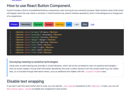
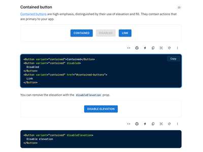
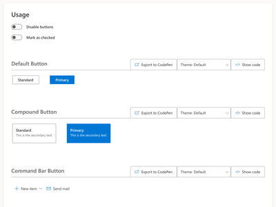
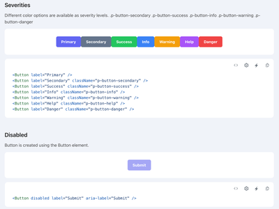
CoreUI React Components library
Popular open-source React UI library that provides a set of pre-designed components and a design system.
CoreUI for React is a popular open-source UI library for building modern and responsive React-based applications. It offers a comprehensive set of UI components, ranging from basic elements like buttons, forms, and icons, to more complex components like data tables, charts, and modals. The library is designed to be fast, lightweight, and easy to use, making it a great choice for developers looking to build high-quality applications with minimal effort.
Installation Guide:
Getting started with CoreUI for React is easy. First, make sure you have a React project set up, then run the following command in your terminal to install the library:
npm install @coreui/react @coreui/coreui
or
yarn add @coreui/react @coreui/coreui
Once installed, you can import the components you need into your React components and start building your application.
Key Features:
- A comprehensive set of UI components, covering everything from basic elements to complex components.
- Designed to be fast, lightweight, and easy to use, making it a great choice for developers of all skill levels.
- Provides a wide range of customization options, allowing you to tailor the library to your specific needs.
- Supports both client-side and server-side rendering, making it a versatile choice for a wide range of projects.
- Regularly updated with new features and bug fixes, ensuring that you always have access to the latest and greatest.
- Built with accessibility in mind, conforming to the latest accessibility standards and guidelines.
- Extensive documentation and a vibrant community of developers, making it easy to get help when you need it.
- Based on the popular Bootstrap framework, leveraging its many years of development and testing to deliver a high-quality UI library.
- Available in a variety of themes and styles, allowing you to easily change the look and feel of your application.
- Integrates seamlessly with other popular React libraries and tools, making it a versatile and flexible choice for your next project.
In conclusion, CoreUI for React.js is a powerful and flexible React UI component library that is ideal for building high-quality user interfaces. With its focus on accessibility, ease of customization, and compatibility with other libraries and tools, it is a valuable resource for any React developer. Whether building a simple website or a complex web application, CoreUI is an excellent choice for anyone looking to save time and effort while building beautiful and functional user interfaces.
You can learn more about CoreUI for React here: https://coreui.io/react/docs/
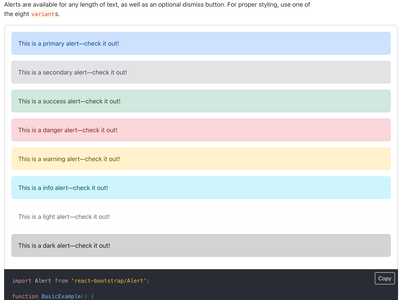
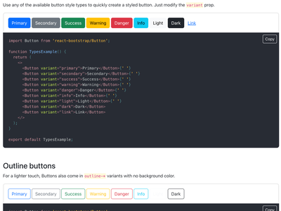
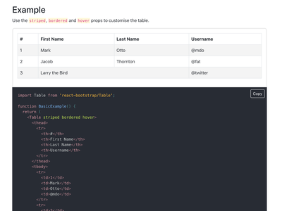
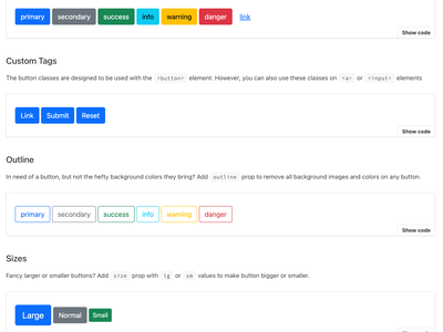
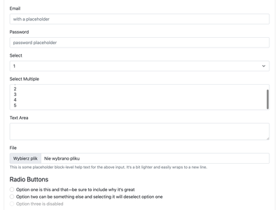
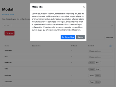
React Bootstrap
Set of React components that implement Bootstrap’s design.
React-Bootstrap is a well-known library of UI components that gives an extensive selection of pre-configured elements, designed to fit the look and feel of Bootstrap, a widespread CSS framework. This library was formulated to make it simple to include responsive, mobile-first components in your React application, without needing to create CSS from the beginning. Its straightforward and understandable API makes it effortless to put together a complex yet user-friendly interfaces.
One of the benefits of using React-Bootstrap is that it provides a consistent look and feel to your application, while still allowing you to customize the appearance of individual components. With its built-in theme support, you can easily change the colors and styles of your application to match your brand’s aesthetic.
Another key feature of React-Bootstrap is its accessibility support. All components are designed to be keyboard-navigable and accessible, making it easy to create applications that are usable by everyone, including those with disabilities. The library also provides built-in accessibility testing tools, so you can ensure that your application is accessible to all users.
React-Bootstrap is comprehensively documented, offering straightforward guidance on how to utilize each component, plus sample code snippets. This makes it simple to begin rapidly adding responsive, mobile-compatible components to your React app. Furthermore, the library is kept up-to-date and stable through active maintenance and bugfixing.
Installation Guide
Installing React-Bootstrap is straightforward, using npm or yarn:
npm install react-bootstrap
or
yarn add react-bootstrap
Once the library has been set up, components or the whole library can be brought into your React component, and be put to use right away. Performance is a priority for this library, so components have been designed for quick rendering and low CPU consumption.
Key features of React-Bootstrap:
- A selection of pre-made elements, including buttons, menus, forms, and more.
- Enhancing the performance of your application through server-side rendering is an available option.
- It is effortless to integrate responsive components into your app with a straightforward and user-friendly
- Support for accessibility, making it easy to create applications that are usable by everyone.
- Well-documented and supported, with clear instructions and example code snippets.
- Actively maintained and bugfixed, ensuring that it remains up-to-date and reliable.
- Free and open-source, accessible to developers of all levels and budgets.
To sum up, React-Bootstrap is a helpful UI element library that simplifies the process of integrating mobile-friendly components into your React application. It offers an easy-to-understand API, accessibility support, and integrated theme support, making it a popular choice for React developers. No matter what type of project you are working on, be it a basic website or an advanced web application, React-Bootstrap is well worth considering.
You can learn more about React-Bootstrap here: https://react-bootstrap.github.io/
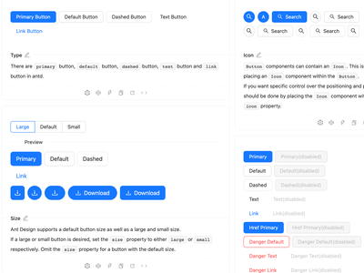
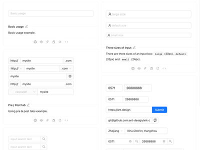
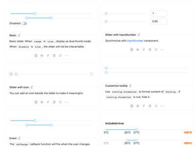
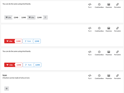
Ant Design
Design system with a set of high-quality React components.
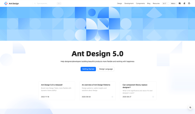
Ant Design is a design system that offers a set of features to help users create digital products. Its components are built to provide users with a consistent user experience. It provides components for navigation, forms, data display, layout, and more. It also offers tools to help users maintain the design integrity of their products.
React developers often use Ant Design as a UI component library, granting access to a variety of pre-made components for building aesthetically appealing and user-friendly interfaces. The library simplifies the process of adding responsive and interactive elements to React apps, eliminating the need to compose custom CSS. Its clean and intuitive design provides a professional look and feel.
One of the key features of Ant Design is its focus on accessibility. All components are designed to be keyboard-navigable and accessible, making it easy to create applications that are usable by everyone, including those with disabilities. The library also provides built-in accessibility testing tools, so you can ensure that your application is accessible to all users.
Ant Design is also well-documented, with clear and concise instructions on how to use each component, as well as example code snippets. This makes it easy to get started and quickly add responsive, mobile-friendly components to your React application. The library is also actively maintained and bugfixed, ensuring that it remains up-to-date and reliable.
Installation Guide
Installing Ant Design is a simple process, using npm or yarn:
npm install antd
or
yarn add antd
Once installed, you can import individual components or the entire library into your React component and start using them right away. Ant Design provides a variety of customization options, allowing you to change the appearance of components to match your brand’s aesthetic. The library also provides an extensive set of customization tools, making it easy to change the theme and style of your application.
Key features of Ant Design
- An array of pre-constructed elements, such as buttons, forms, symbols, and other items.
- An API that is straightforward and uncomplicated, making it a breeze to add adaptive components to your web application
- Possibility to customize components to fit the look and feel of your company.
- Support for accessibility, making it easy to create applications that are usable by everyone.
- Clear guidance and example code pieces are available with appropriate documentation and assistance.
- The software is kept current and dependable through regular maintenance and fixes for any errors.
- Free and open-source, accessible to developers of all levels and budgets.
- Built-in internationalization support, making it easy to create multi-lingual applications.
- Extensive design system, including typography, icons, and more.
To wrap up, Ant Design is a thorough UI element library that gives React applications a professional and pleasing visual look. Its attention to accessibility, the extensive customization it offers, and its extensive documentation make it a beloved choice for React developers. Regardless of whether one is making a humble website or a complex web app, Ant Design is a library worth considering.
You can learn more about Ant Design here: https://ant.design
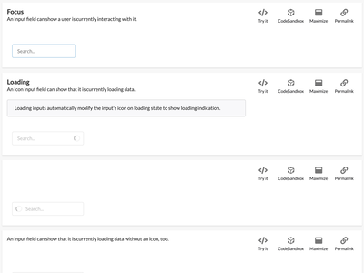
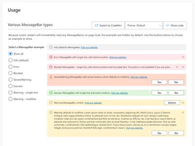
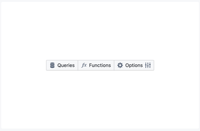
Semantic UI React
Popular CSS framework that provides a wide range of ready-to-use UI components.
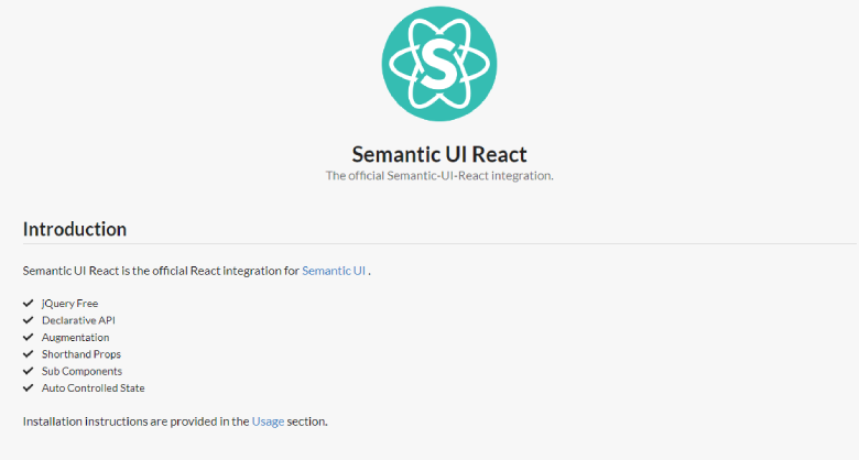
Semantic UI React is a UI component library for React that provides a set of pre-designed, ready-to-use components for building modern, user-friendly interfaces. Its primary focus is on being simple and straightforward. It provides a broad range of components, such as buttons, forms, icons, etc., making it effortless to add reactive and interactive features to an application.
Semantic UI React pays particular attention to accessibility. It has been designed with keyboard navigation and other features that make it possible for everyone to make use of it, including those with disabilities. The library comes with built-in tests for accessibility, so you can make sure that your application is accommodating for all users.
The library of Semantic UI React is well-documented, with explicit and succinct instructions on how to use each component, as well as sample code snippets. This makes it effortless to initiate and instantly incorporate reactive, mobile-friendly components to your React application. Additionally, the library is kept up to date and stable, due to active maintenance and bugfixing.
Installation Guide
To install Semantic UI React, you can use npm or yarn:
npm install semantic-ui-react
or
yarn add semantic-ui-react
Once installed, you can import individual components or the entire library into your React part and begin utilizing them right away. Semantic UI React has a diversity of personalization settings, such as themes, styles, and so forth, making it straightforward to adapt the look of components to fit your brand.
Key features of Semantic UI:
- A varied assortment of ready-made elements, such as buttons, forms, icons, etc.
- An API that is straightforward and user-friendly, allowing you to incorporate responsive components into your application easily.
- Have the ability to customize components to create a look that reflects your brand.
- Support for accessibility, making it easy to create applications that are usable by everyone.
- Comprehensive documentation and assistance is available, with explicit directions and sample code snippets included.
- Consistently maintained and bugs solved, making sure that it is current and dependable.
- Accessible to developers with any skill level and financial resources, this software is open-source and free.
- Possibility to incorporate multi-language capabilities into the application through its integrated globalisation system.
- A comprehensive design system featuring typography, icons, and other components.
To sum up, Semantic UI React is an approachable UI component library for React. It provides a sizable selection of pre-made components that are straightforward to customize and integrate into your projects. Thanks to its emphasis on accessibility, excellent documentation, and ongoing maintenance, Semantic UI React is a popular option among React developers. If you are crafting a basic website or a complicated web application, Semantic UI React is a library to consider.
You can learn more about Semantic UI React here: https://react.semantic-ui.com
MUI - Material UI
Popular React UI library that implements Google’s Material Design guidelines.
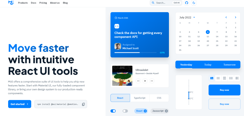
MUI, a React UI component library, is a popular option for projects that require a user-friendly and visually appealing interface. It follows the guidelines of Google’s Material Design, and offers a wide selection of pre-designed components. Furthermore, it is reliable due to its support for accessibility, server-side rendering, internationalization, and regular updates.
MUI stands out for its ability to provide access to a wide range of users, including those with disabilities. Its components are designed to be keyboard-navigable, and the library offers testing tools to make sure that everyone can benefit from the application.
MUI also supports SSR, which can improve the performance of your application. By rendering components on the server, you can reduce the amount of data that needs to be sent to the client, which can result in faster load times and a better user experience.
Another important feature of MUI is its well-documented and supported nature. The library has a large community of developers who contribute to and use it, making it easy to find help and guidance when you need it. The documentation is comprehensive and easy to follow, and the library is regularly updated and bugfixed, ensuring that it remains up-to-date and reliable.
Installation Guide
Installation of MUI is easy and uncomplicated. You can utilize either of npm or yarn to install it by executing the following command in your terminal:
npm install @mui/material @emotion/react @emotion/styled
or
yarn add @mui/material @emotion/react @emotion/styled
After installation, you can import individual components or the complete library into your React component. MUI provides you the option to customize the look of your application with predefined themes and styles. This allows you to generate a distinct and consistent design that is consistent with your brand’s look.
Key features of MUI:
- A wide range of pre-designed components, including buttons, form elements, navigation, and more.
- Simple integration with other libraries and tools, such as Redux and React Router.
- Support for internationalization, allowing applications to be localized and translated into different languages.
- Robust and flexible, with a wide range of options and configurations for each component.
- Free and open-source, making it accessible to developers of all levels and budgets.
To wrap up, MUI (Material-UI) is a dependable React UI component library that is suitable for a broad range of projects. With its pre-made components, personalization possibilities, accessibility aid, and simple combination with other libraries, it is a favored selection among React developers. No matter if you are working on a small individual venture or a large business application, MUI (Material-UI) is a library worth pondering.
You can learn more about MUI here: https://mui.com/material-ui/getting-started/overview/
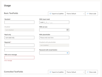
Fluent UI
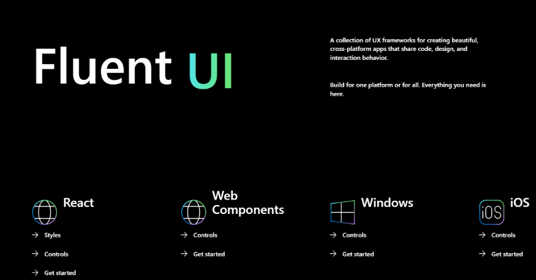
Fluent UI React is a collection of reusable UI components for React that is designed to help developers build modern, feature-rich applications. The library is based on Microsoft’s Fluent Design System and offers a range of components that can be used to create engaging and visually appealing user interfaces. Fluent UI React components are designed to work seamlessly with other Microsoft technologies, including SharePoint and Power Apps.
Installation Guide
To install Fluent UI React, you can use npm by running the following command in your terminal:
npm install @fluentui/react
or
yarn add @fluentui/react
After installation, you can import individual components or the complete library into your React component.
Key features of Fluent UI:
- Based on Microsoft’s Fluent Design System.
- A wide range of components, including input controls, data visualization, and more.
- Works seamlessly with other Microsoft technologies, including SharePoint and Power Apps.
- Offers a flexible, modular architecture that can be easily customized to fit any project.
- Designed to be easy to use and integrate into your project.
- Supports both client-side and SSR.
- Extensive documentation and a vibrant community of developers.
- Regularly updated with new features and bug fixes.
- Built with accessibility in mind and conforms to accessibility standards.
- Offers a modern and visually appealing look and feel.
You can learn more about FluentUI here: https://developer.microsoft.com/en-us/fluentui#/get-started/web
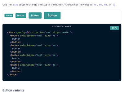
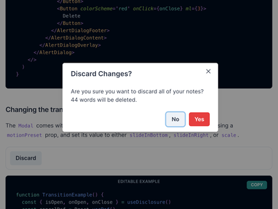
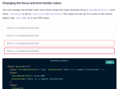
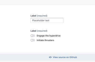
Chakra UI
Modular and accessible design system for React.js applications.
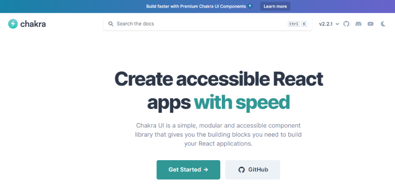
Chakra UI is a library of components that enables developers to quickly build user interfaces with accessible and composable React components. It is designed from the ground up to be highly customizable and incorporate best practices for a11y, color accessibility, motion, and more. With its unique design system, Chakra UI provides a platform for developers to create a unified experience for their users.
React developers looking to build modern and user-friendly applications can utilize Chakra UI, a UI component library providing a suite of pre-crafted and accessible components. This library makes it simple to add interactive and responsive elements to your app as it offers a variety of components, from icons to buttons to forms. With a concentration on accessibility and usability, Chakra UI is a go-to solution for those in the React community.
The primary goal of Chakra UI is to ensure accessibility. Its components are all crafted to meet the necessary standards, enabling developers to create apps that can be used by everyone, including those with disabilities. The library also provides built-in testing tools to guarantee that the app is accessible to all users.
The documentation for Chakra UI is comprehensive, containing straightforward instructions for every component, as well as code snippets for illustration. This makes it convenient for developers to quickly integrate reactive, mobile-compatible components into their React projects. Moreover, the library is regularly updated and bugs are fixed in a timely manner, providing trustworthiness and keeping it current.
Installation Guide
To install Chakra UI, you can use npm or yarn:
npm install @chakra-ui/core
or
yarn add @chakra-ui/core
When you have set up Chakra UI, you can incorporate individual or all of the components into your React component. It provides a lot of customization alternatives, such as themes, styles, and other features, which will make it simple to alter the look of the components to suit your branding.
Key features of Chakra UI
- A wide selection of ready-made elements, such as buttons, forms, icons, and more.
- API that is straightforward and easy to understand, allowing you to incorporate responsive parts into your program quickly.
- The ability to alter the look of components to correspond with your business identity is available through a variety of customization options.
- Support for accessibility, making it easy to create applications that are usable by everyone.
- Well-documented and supported, with explicit directions and sample code snippets included.
- Actively maintained and bugfixed, ensuring that it remains up-to-date and reliable.
- Free and open-source, accessible to developers of all levels and budgets.
- Possibility of developing applications in multiple languages due to the integrated internationalization feature.
- Extensive design system, including typography, icons, and more.
- Simple and intuitive design, making it easy to create modern, user-friendly interfaces.
In conclusion, Chakra UI is a user-friendly UI component library for React, offering a wide range of pre-designed components that are easy to customize and use in your applications. With its focus on accessibility, well-documented support, and active maintenance, Chakra UI is a popular choice among React developers. No matter if you’re constructing a basic website or a complex web application, Chakra UI is certainly worth exploring.
You can learn more about Chakra UI here: https://chakra-ui.com
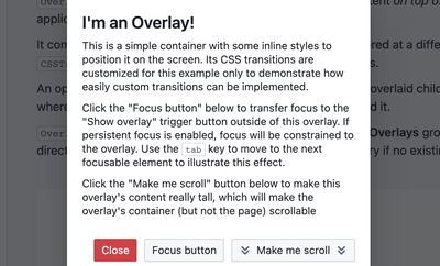
Blueprint UI
React-based UI toolkit for the web.
Blueprint UI is a React-based library of UI components that offers an array of pre-built, easy-to-utilize elements for constructing modern, user-friendly applications. Featuring its emphasis on simplicity and usability, Blueprint UI is a popular selection for React developers who are looking to rapidly add interactive, responsive elements to their projects. This library offers a broad variety of components, such as buttons, forms, icons, and more, thus making it convenient to form contemporary, responsive interfaces.
Blueprint UI puts emphasis on being straightforward and user-friendly. It makes utilization of the library uncomplicated with a plain and understandable API. Furthermore, the library is documented thoroughly with instructions on how each component works and example code.
One of the distinguishing features of Blueprint UI is its capability to accommodate accessibility. The library has components that make it possible for users with impairments to access and use the application. In addition, Blueprint UI is continually maintained and debugged, keeping it updated and dependable.
Installation Guide
To install Blueprint UI, you can use npm or yarn:
npm install @blueprintjs/core
or
yarn add @blueprintjs/core
Once setup is complete, you can include single components or the whole library into your React module and begin using them immediately. Blueprint UI supplies a variety of customization features, such as themes, styles, and others, making it simple to alter the look of components to fit your company’s identity.
Key features of Blueprint UI
- An extensive selection of pre-constructed components, such as buttons, forms, icons, and more.
- Simple and intuitive API, making it easy to add responsive components to your application.
- A range of personalization choices which can be used to adjust components to reflect your company’s style.
- Accessibility support, ensuring that your application is usable by everyone.
- Comprehensive documentation and technical support, with explicit directions and sample code snippets.
- Actively maintained and bugfixed, ensuring that it remains up-to-date and reliable.
- Free and open-source, accessible to developers of all levels and budgets.
- Large community of developers and users, providing a wealth of resources and support.
- Advanced components, such as dialogs, popovers, and more.
- A modern, intuitive design, making it easy to create user-friendly interfaces.
To sum it up, Blueprint UI is an easy-to-use React-based UI library that offers a wide variety of pre-made components that can be personalized for one’s own applications. Its focus on ease and simplicity is why it is a popular choice among React developers who want to make modern, responsive applications. It is a library that is worth looking into, no matter if the project is a small website or a complex web application.
You can learn more about Blueprint here: https://blueprintjs.com/
Reactstrap
Library of React components that implement Bootstrap’s design.
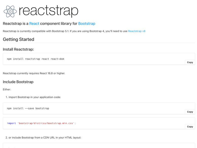
The Reactstrap library is a collection of components that are based on the Bootstrap framework, allowing developers to quickly create user interfaces without the need for additional coding. It is a convenient way to rapidly generate user interfaces that are compliant with the Bootstrap framework.
A popular UI component library for React, Reactstrap offers a wide array of pre-constructed components for creating contemporary, user-friendly applications. Structured around Bootstrap - a common front-end framework - Reactstrap simplifies the process of introducing interactive, responsive elements to React applications. It has a broad collection of buttons, forms, icons, and other pre-made components, thus making the development of modern user interfaces much more efficient.
One of the key benefits of Reactstrap is its focus on simplicity and ease of use. The library provides a simple and intuitive API, making it easy to add responsive components to your application. Additionally, Reactstrap is well-documented, with clear and concise instructions on how to use each component, as well as example code snippets.
Another benefit of Reactstrap is its ability to integrate seamlessly with other React libraries and tools. For example, Reactstrap components can be used in combination with other UI libraries, such as Material-UI or Ant Design, allowing you to build complex and sophisticated user interfaces with ease.
Installation Guide
To install Reactstrap, you can use npm or yarn:
npm install reactstrap bootstrap
or
yarn add reactstrap bootstrap
Once installed, you can import individual components or the entire library into your React component and start using them right away. Reactstrap provides a variety of customization options, including themes, styles, and more, making it easy to change the appearance of components to match your brand.
Key features of Reactstrap
- A comprehensive collection of pre-designed components, including buttons, forms, icons, and more.
- Simple and intuitive API, making it easy to add responsive components to your application.
- Extensive customization options, allowing you to change the appearance of components to match your brand.
- Well-documented and supported, with clear instructions and example code snippets.
- Integration with other React libraries and tools, allowing you to build complex and sophisticated user interfaces.
- Free and open-source, accessible to developers of all levels and budgets.
- Large community of developers and users, providing a wealth of resources and support.
- Lightweight and efficient, with minimal dependencies and a small footprint.
- Based on Bootstrap, a widely-used front-end framework, ensuring compatibility and reliability.
- Modern and intuitive design, making it easy to create user-friendly interfaces.
To wrap up, Reactstrap is an effective and uncomplicated user interface component library for React, offering a broad array of pre-created components that are customizable and can be integrated into applications. Focusing on simplicity and usability, Reactstrap is a preferred option for React developers wanting to construct modern, adaptable applications. Regardless of whether you are designing a straightforward website or an intricate web application, Reactstrap is worth considering.
You can learn more about Reactstrap here: https://reactstrap.github.io/
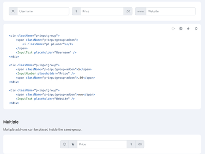
Primereact
Collection of UI components for React applications, built by PrimeTek.
PrimeReact is a collection of UI components for React that is designed to fit into a variety of projects and applications. The library offers a wide range of components, including input controls, data visualization, and more, that are optimized for performance and can be styled to fit any design system. One of the key features of PrimeReact is its ability to work seamlessly with both React and Redux, allowing developers to build powerful, feature-rich applications with ease.
Installation Guide
To install PrimeReact, you can use npm by running the following command in your terminal:
npm install primereact
or
yarn add primereact
Key features of Blueprint UI
- A wide range of components, including input controls, data visualization, and more.
- Optimized for performance and optimized for style.
- Works seamlessly with both React and Redux.
- Wide range of themes available, including Material, Bootstrap, and more.
- Offers a flexible, modular architecture that can be easily customized to fit any project.
- Designed to be easy to use and integrate into your project.
- Supports both client-side and server-side rendering.
- Extensive documentation and a vibrant community of developers.
- Regularly updated with new features and bug fixes.
- Built with accessibility in mind and conforms to accessibility standards.

You can learn more about Primereact here: https://primereact.org
Conclusion
In conclusion, React UI frameworks and components libraries mentioned above are the best among all the existing libraries and frameworks over the internet. It is suitable for beginners and beneficial for advanced developers due to its compatibility and unique features. The frameworks and libraries mentioned above have multiple unique features and tools that make them outstanding and better than others.
Therefore, looking ahead to creating a feature-rich website or application using React, look at our post and find an ideal solution for your project. Also, you can reach out to reactJS developers for hire who can build react applications for you as per your requirements and business needs.
So, which React framework or library have you found the most appealing?