How to build a dashboard in React
 Łukasz Holeczek
Follow Łukasz Holeczek on GitHub
Connect with Łukasz Holeczek on LinkedIn
Follow Łukasz Holeczek on X (Twitter)
Łukasz Holeczek
Follow Łukasz Holeczek on GitHub
Connect with Łukasz Holeczek on LinkedIn
Follow Łukasz Holeczek on X (Twitter)
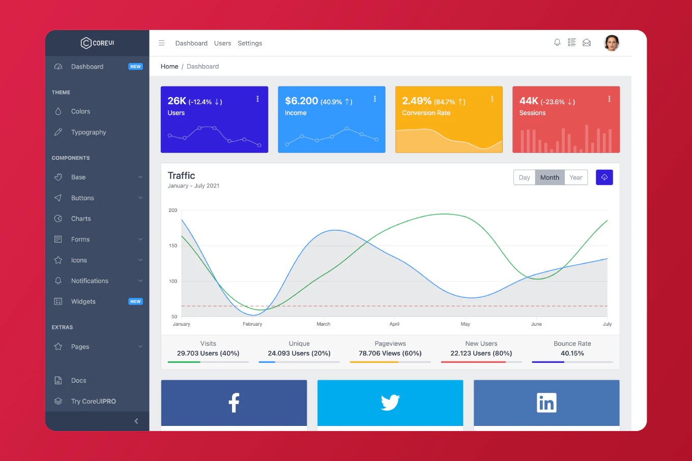
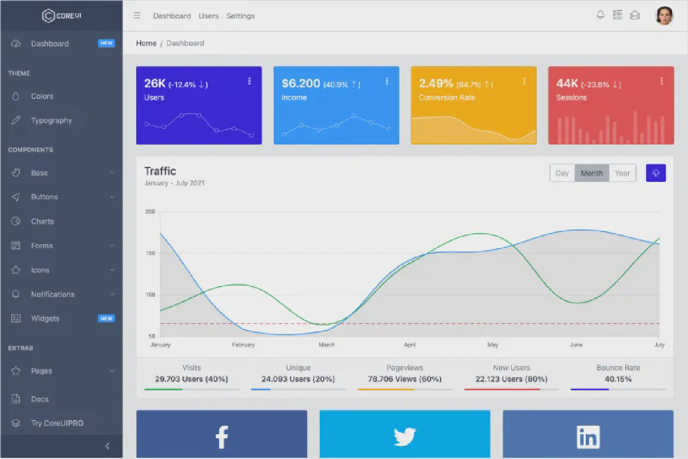
Building a dashboard in React requires organizing multiple data visualizations, widgets, and navigation elements into a coherent, responsive interface. With over 10 years of experience building React applications and as the creator of CoreUI, a widely used admin template library, I’ve architected hundreds of dashboards for enterprise applications. From my expertise, the most effective approach is to create a flexible layout system using CSS Grid combined with reusable React components for widgets and data displays. This method provides responsive layouts, maintainable code, and excellent performance.
Create a dashboard layout using CSS Grid and modular React components for widgets.
const Dashboard = () => {
  return (
    <div className='dashboard'>
      <Sidebar />
      <main className='content'>
        <Header />
        <div className='grid'>
          <StatsCard title='Users' value='1,234' />
          <StatsCard title='Revenue' value='$56,789' />
          <Chart title='Monthly Sales' />
          <RecentActivity />
        </div>
      </main>
    </div>
  )
}
How It Works
The dashboard consists of a sidebar for navigation, a header with user info and actions, and a grid of widgets displaying various metrics and data. CSS Grid handles the responsive layout, automatically adjusting widget positions based on screen size. Each component (StatsCard, Chart, RecentActivity) is self-contained and reusable, making the dashboard easy to modify and extend.
Dashboard Layout Structure
Set up the basic dashboard layout with CSS Grid:
const Dashboard = () => {
  return (
    <div className='dashboard-layout'>
      <aside className='sidebar'>
        <nav>
          <a href='/'>Dashboard</a>
          <a href='/users'>Users</a>
          <a href='/settings'>Settings</a>
        </nav>
      </aside>
      <div className='main-content'>
        <header className='header'>
          <h1>Dashboard</h1>
          <div className='user-menu'>Welcome, User</div>
        </header>
        <div className='widgets-grid'>
          {/* Widgets go here */}
        </div>
      </div>
    </div>
  )
}
The layout uses a sidebar-content structure. The sidebar contains navigation links, while the main content area includes a header and a grid for widgets. This is the foundation that all dashboard features build upon.
The CSS for this layout:
.dashboard-layout {
  display: grid;
  grid-template-columns: 250px 1fr;
  min-height: 100vh;
}

.main-content {
  display: flex;
  flex-direction: column;
}

.widgets-grid {
  display: grid;
  grid-template-columns: repeat(auto-fit, minmax(300px, 1fr));
  gap: 20px;
  padding: 20px;
}
Creating Reusable Widget Components
Build a stats card component for displaying metrics:
const StatsCard = ({ title, value, icon, trend }) => {
  return (
    <div className='stats-card'>
      <div className='stats-header'>
        <span className='stats-title'>{title}</span>
        <span className='stats-icon'>{icon}</span>
      </div>
      <div className='stats-value'>{value}</div>
      {trend && (
        <div className={`stats-trend ${trend > 0 ? 'positive' : 'negative'}`}>
          {trend > 0 ? '↑' : '↓'} {Math.abs(trend)}%
        </div>
      )}
    </div>
  )
}

// Usage
<StatsCard
  title='Total Users'
  value='1,234'
  icon='👥'
  trend={12.5}
/>
The StatsCard component displays a metric with optional trend indicator. Props make it flexible - you can show different metrics with consistent styling. The trend calculation determines whether to show an up or down arrow, giving users instant insight into performance changes.
Fetching Dashboard Data
Load data from an API when the dashboard mounts:
import { useState, useEffect } from 'react'

const Dashboard = () => {
  const [stats, setStats] = useState(null)
  const [loading, setLoading] = useState(true)

  useEffect(() => {
    const fetchDashboardData = async () => {
      try {
        const response = await fetch('/api/dashboard')
        const data = await response.json()
        setStats(data)
      } catch (error) {
        console.error('Failed to fetch dashboard data:', error)
      } finally {
        setLoading(false)
      }
    }

    fetchDashboardData()
  }, [])

  if (loading) {
    return <div>Loading dashboard...</div>
  }

  return (
    <div className='widgets-grid'>
      <StatsCard title='Users' value={stats.users} />
      <StatsCard title='Revenue' value={`$${stats.revenue}`} />
    </div>
  )
}
The useEffect hook fetches dashboard data on component mount. The loading state shows a loading indicator while data is being fetched. Once loaded, the stats are passed to widget components as props. Error handling ensures the dashboard degrades gracefully if the API fails.
Creating a Chart Widget
Integrate a chart library for data visualization:
import { LineChart, Line, XAxis, YAxis, CartesianGrid, Tooltip } from 'recharts'

const SalesChart = ({ data }) => {
  return (
    <div className='chart-widget'>
      <h3>Monthly Sales</h3>
      <LineChart width={500} height={300} data={data}>
        <CartesianGrid strokeDasharray='3 3' />
        <XAxis dataKey='month' />
        <YAxis />
        <Tooltip />
        <Line type='monotone' dataKey='sales' stroke='#8884d8' />
      </LineChart>
    </div>
  )
}

// Usage
const salesData = [
  { month: 'Jan', sales: 4000 },
  { month: 'Feb', sales: 3000 },
  { month: 'Mar', sales: 5000 }
]

<SalesChart data={salesData} />
Using a library like Recharts provides interactive, responsive charts with minimal code. The data prop makes the chart reusable with different datasets. Charts are essential for dashboards as they turn raw numbers into visual insights that are easier to understand at a glance.
Building a Data Table Widget
Display tabular data with sorting and filtering:
const DataTable = ({ data, columns }) => {
  const [sortedData, setSortedData] = useState(data)

  const handleSort = (key) => {
    const sorted = [...sortedData].sort((a, b) =>
      a[key] > b[key] ? 1 : -1
    )
    setSortedData(sorted)
  }

  return (
    <div className='table-widget'>
      <table>
        <thead>
          <tr>
            {columns.map((col) => (
              <th key={col.key} onClick={() => handleSort(col.key)}>
                {col.label}
              </th>
            ))}
          </tr>
        </thead>
        <tbody>
          {sortedData.map((row, idx) => (
            <tr key={idx}>
              {columns.map((col) => (
                <td key={col.key}>{row[col.key]}</td>
              ))}
            </tr>
          ))}
        </tbody>
      </table>
    </div>
  )
}

// Usage
<DataTable
  data={users}
  columns={[
    { key: 'name', label: 'Name' },
    { key: 'email', label: 'Email' }
  ]}
/>
This table component accepts data and column configuration, making it highly reusable. Click handlers on headers enable sorting. The table displays structured data clearly, perfect for user lists, transaction logs, or any tabular dashboard content.
Responsive Dashboard Layout
Make the dashboard responsive for mobile devices:
.widgets-grid {
  display: grid;
  grid-template-columns: repeat(auto-fit, minmax(300px, 1fr));
  gap: 20px;
}

@media (max-width: 768px) {
  .dashboard-layout {
    grid-template-columns: 1fr;
  }

  .sidebar {
    position: fixed;
    transform: translateX(-100%);
    transition: transform 0.3s;
  }

  .sidebar.open {
    transform: translateX(0);
  }

  .widgets-grid {
    grid-template-columns: 1fr;
  }
}
The auto-fit and minmax() CSS functions create a responsive grid that automatically adjusts columns based on available space. On mobile, the sidebar becomes a slide-out menu, and widgets stack vertically. This ensures the dashboard works well on all screen sizes.
Best Practice Note
This is the same dashboard architecture we use in CoreUI React templates, which power thousands of admin panels worldwide. For production dashboards, consider using CoreUI React admin template which provides pre-built dashboard layouts, widgets, and components with consistent styling. Always optimize dashboard performance by lazy-loading widgets, memoizing expensive calculations, and using virtualization for large data tables. Learn more about how to prevent unnecessary re-renders in React to keep your dashboard performant. A well-designed dashboard balances information density with usability - show the most important metrics prominently and provide drill-down capabilities for details.