CoreUI PRO for React v5.29.1 - Time Picker, Calendar and Date Picker Fixes

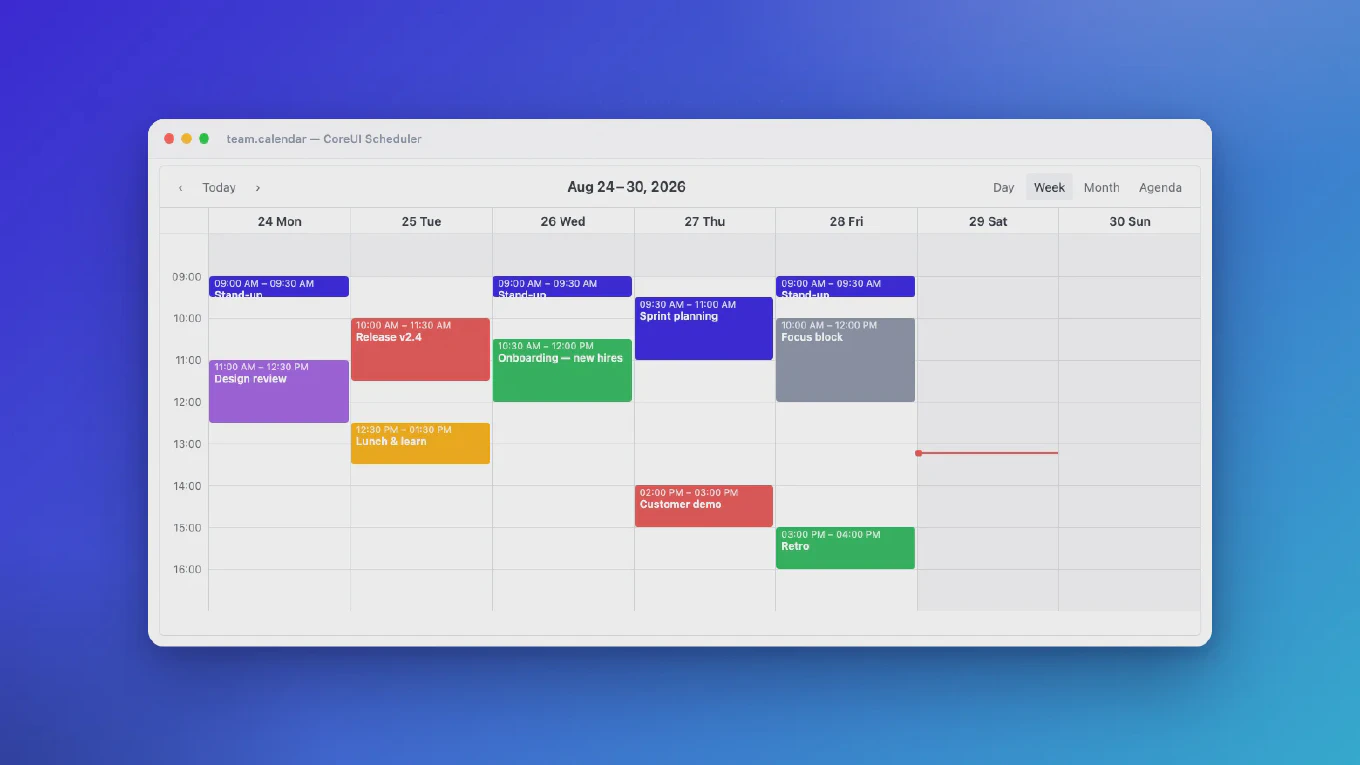
We are pleased to announce the release of CoreUI PRO for React v5.29.1. This patch release fixes how CTimePicker handles an empty value, makes CCalendar open on a month with days to pick when minDate or maxDate exclude today, and makes CDatePicker and CDateRangePicker pass the formatted date their callbacks declare.
CoreUI for React v5.13.1 - Offcanvas and Chip Input Fixes
We are pleased to announce the release of CoreUI for React v5.13.1. This maintenance release gives the page its scrolling back when a visible COffcanvas unmounts, fixes the disabled and readonly states of CChipInput, and moves to the @coreui/coreui v5.9.1 stylesheet.
CoreUI PRO for React v5.29.0 - Time Granularity in the Date Pickers
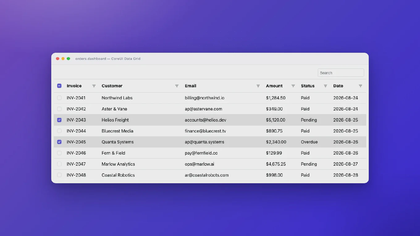
We are pleased to announce the release of CoreUI PRO for React v5.29.0. CDatePicker and CDateRangePicker can now drop minutes and seconds from their time selection. The release also keeps internal fields out of submitted form data and fixes CCalendar, CMultiSelect, CAutocomplete and COneTimePassword.
CoreUI Free React Admin Template v5.7.0 - Navigation Reorganization and New Demos
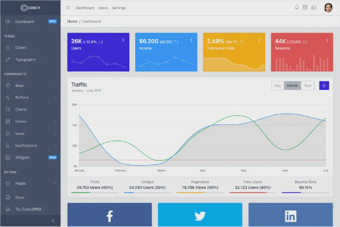
We are pleased to announce the release of CoreUI Free React Admin Template v5.7.0. This release aligns the navigation and views with the information architecture of the Bootstrap template, adds new component demos, and refreshes the documentation and dependencies.
CoreUI PRO React Admin Template v5.10.0 - Navigation Reorganization and FullCalendar 7
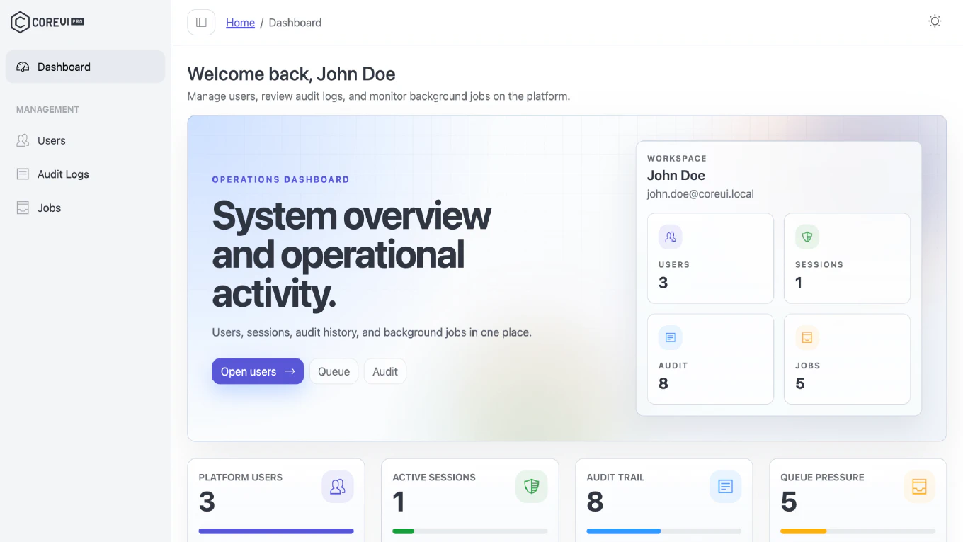
We are excited to announce the release of CoreUI PRO React Admin Template v5.10.0. This release aligns the navigation and views with the information architecture of the Bootstrap PRO template, migrates FullCalendar to version 7, adds new component demos, and fixes several issues in the header and the dashboard.
CoreUI PRO for React v5.27.1 - Picker and One-Time Password Fixes
We are pleased to announce the release of CoreUI PRO for React v5.27.1. This maintenance release improves one-time password autofill, fixes the CDatePicker and CDateRangePicker Today button behavior, and refreshes the documentation tooling. No breaking changes were announced in the published release notes.
CoreUI PRO for React v5.28.0 - Custom Container for Picker Dropdowns
We are pleased to announce the release of CoreUI PRO for React v5.28.0. This release extends the container property of CDatePicker, CDateRangePicker and CTimePicker, so their dropdown can be rendered in a container of your choice. No breaking changes were announced in the published release notes.
CoreUI for React v5.13.0 - CAlert & CButton Enhancements, Accessibility Improvements
CoreUI PRO for React v5.27.0 - Accessibility, Security & Picker Improvements
We are excited to announce the release of CoreUI PRO for React v5.27.0. This release brings extensive accessibility improvements across the CAutocomplete, CCalendar, CMultiSelect, CRangeSlider, and CRating components, security hardening, and a range of picker and stability fixes.
CoreUI for React v5.12.0 - ChipSet, NavGroup Redesign & Major Improvements
We are excited to announce the release of CoreUI for React v5.12.0. This is a major feature release introducing the new Chip Set component with filter chips, a redesigned CNavGroup with controlled visibility, carousel touch swipe support, and many important bug fixes including memory leak prevention in CDropdown, CTooltip, CPopover, CModal, and CCarousel.