How to build a sidebar in Vue
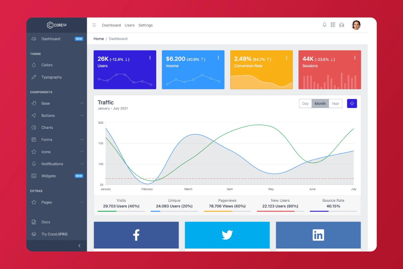
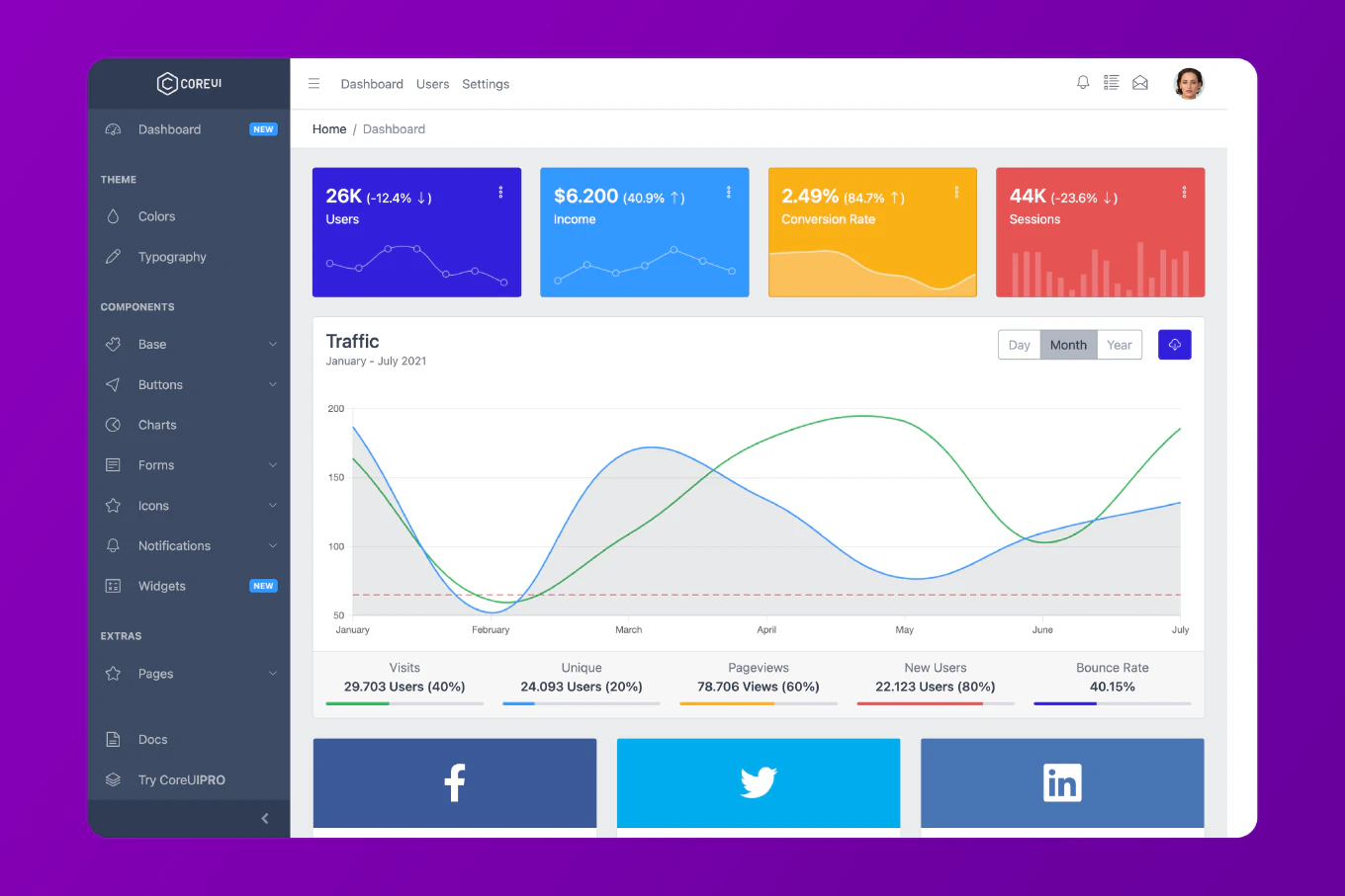
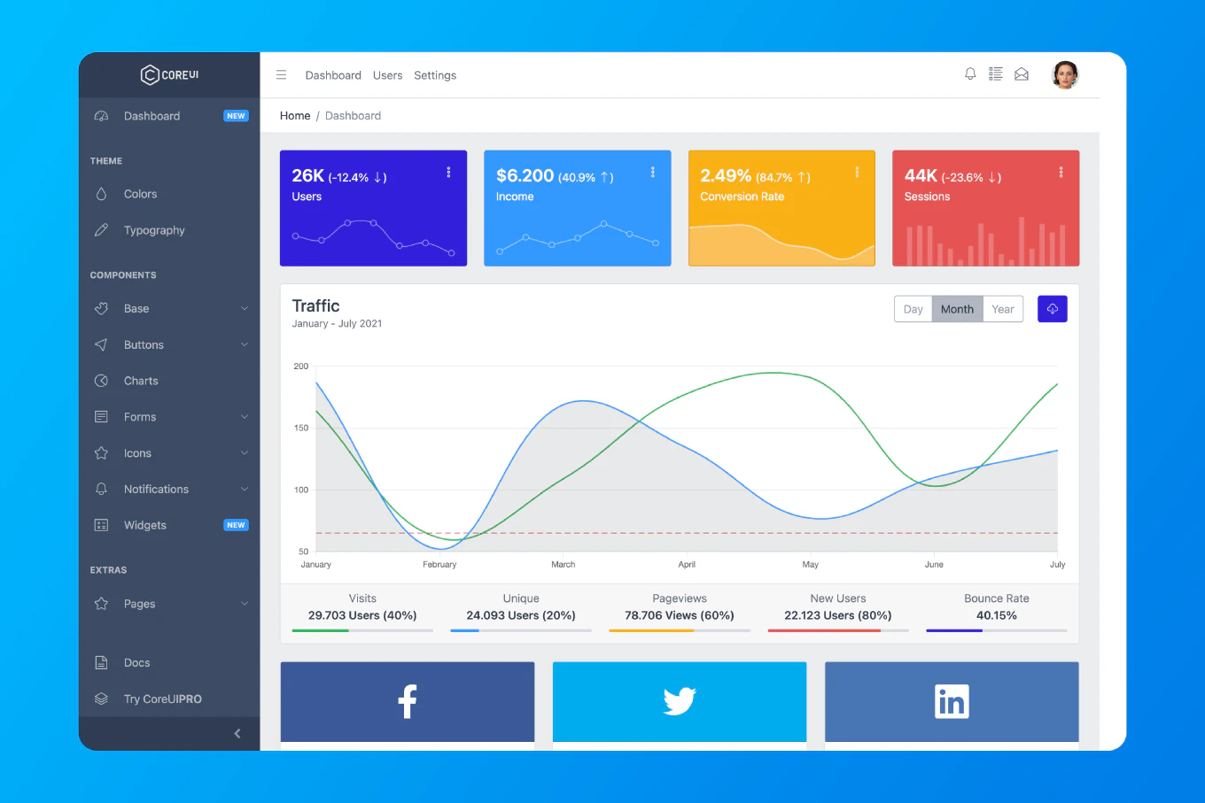
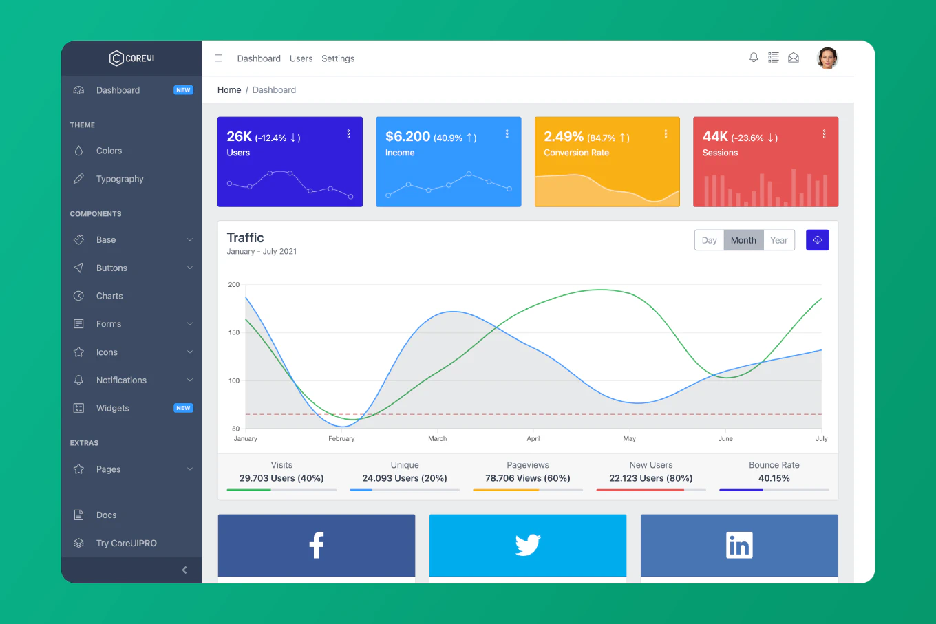
Sidebars provide persistent navigation for applications, offering quick access to main sections while maximizing content space in the main area. As the creator of CoreUI, a widely used open-source UI library, I’ve built sidebar navigation systems in Vue applications throughout my 11 years of Vue development. The most effective approach is creating a sidebar component with Composition API managing collapse state and responsive behavior. This method ensures consistent navigation with smooth transitions and mobile-friendly toggle functionality.
Create a sidebar component with toggle state and responsive CSS for mobile devices.
<template>
  <div class="layout">
    <aside :class="['sidebar', { collapsed: isCollapsed }]">
      <div class="sidebar-header">
        <h2>MyApp</h2>
        <button @click="isCollapsed = !isCollapsed" class="toggle-btn">
          ☰
        </button>
      </div>
      <nav class="sidebar-nav">
        <router-link to="/" class="nav-item">Dashboard</router-link>
        <router-link to="/users" class="nav-item">Users</router-link>
        <router-link to="/settings" class="nav-item">Settings</router-link>
      </nav>
    </aside>
    <main class="main-content">
      <slot></slot>
    </main>
  </div>
</template>

<script setup>
import { ref } from 'vue'

const isCollapsed = ref(false)
</script>

<style scoped>
.layout {
  display: flex;
  min-height: 100vh;
}

.sidebar {
  width: 250px;
  background: #2c3e50;
  color: white;
  transition: width 0.3s;
}

.sidebar.collapsed {
  width: 60px;
}

.sidebar-header {
  padding: 1rem;
  display: flex;
  justify-content: space-between;
  align-items: center;
}

.toggle-btn {
  background: none;
  border: none;
  color: white;
  font-size: 1.5rem;
  cursor: pointer;
}

.sidebar-nav {
  display: flex;
  flex-direction: column;
}

.nav-item {
  padding: 1rem;
  color: white;
  text-decoration: none;
  transition: background 0.2s;
}

.nav-item:hover {
  background: rgba(255,255,255,0.1);
}

.nav-item.router-link-active {
  background: rgba(255,255,255,0.2);
}

.main-content {
  flex: 1;
  padding: 2rem;
}

@media (max-width: 768px) {
  .sidebar {
    position: fixed;
    left: 0;
    top: 0;
    bottom: 0;
    z-index: 1000;
    transform: translateX(-100%);
  }

  .sidebar:not(.collapsed) {
    transform: translateX(0);
  }
}
</style>
Here the sidebar component uses isCollapsed reactive state to control width. The toggle button switches between expanded and collapsed states. Router-link components provide navigation with automatic active class application. The flexbox layout places sidebar and main content side-by-side. Media queries transform the sidebar to a mobile overlay that slides in from the left when toggled. The transition property smoothly animates width changes.
Best Practice Note:
This is the sidebar pattern we implement in CoreUI Vue admin templates for consistent navigation across applications. Add keyboard shortcuts for accessibility, implement focus trapping when sidebar is open on mobile, and persist sidebar state in localStorage to remember user preferences across sessions.


