Leave well alone?
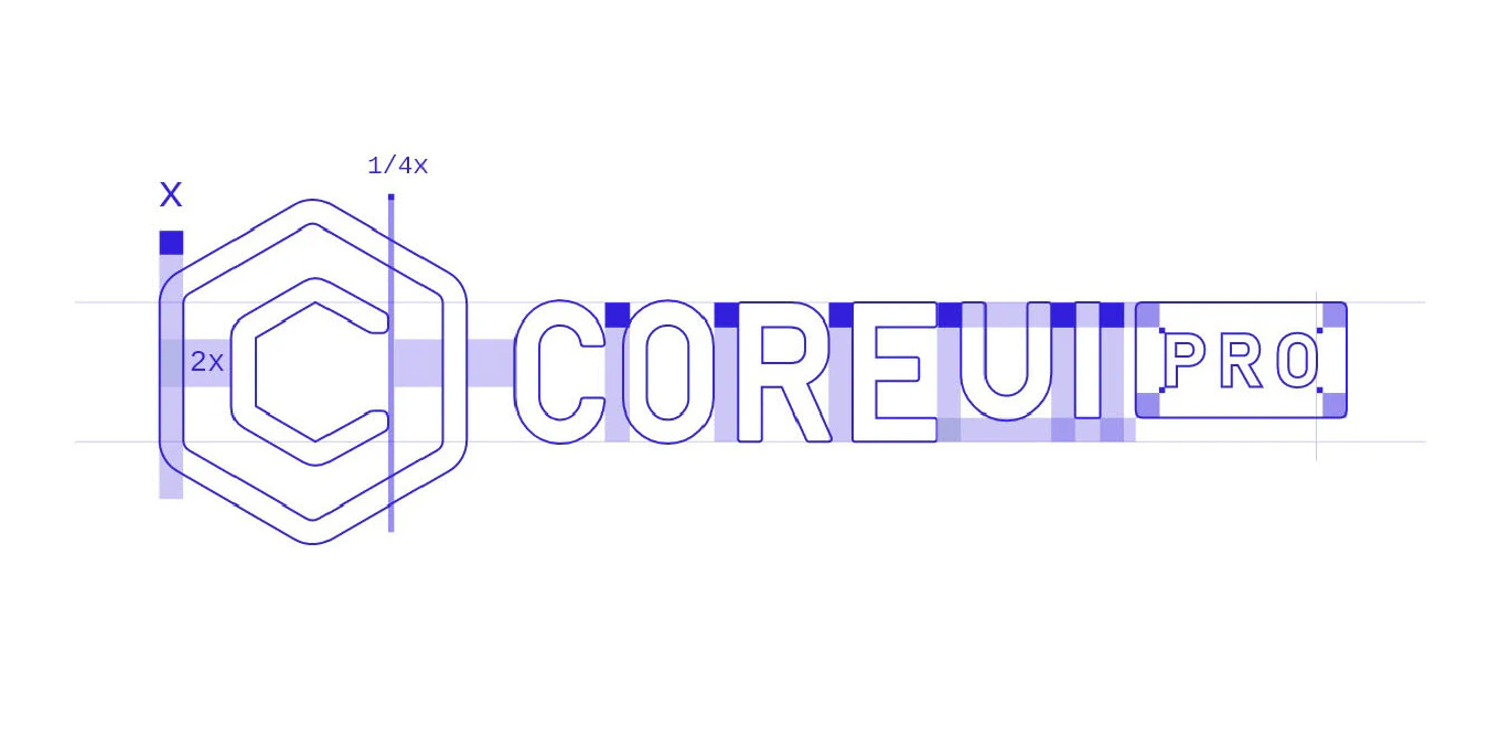
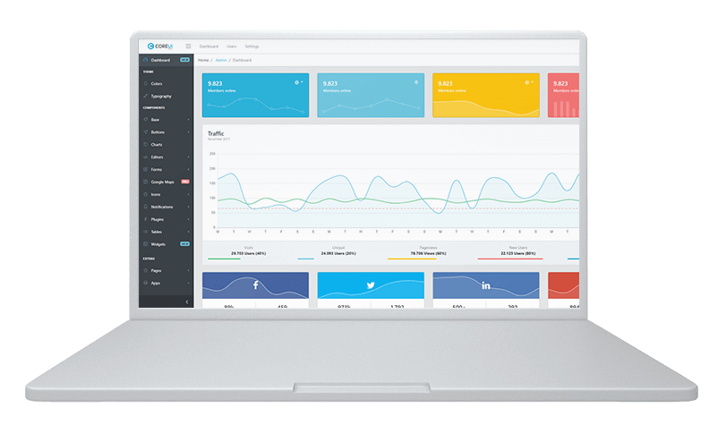
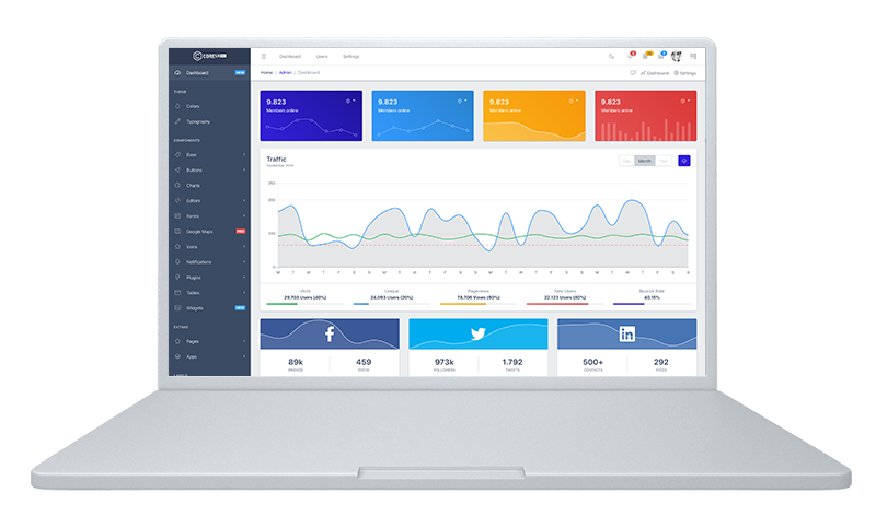
We believe that we all know that sentence, but to be honest - like humans, companies change over time and, when it does, a brand redesign becomes necessary. We bet you noticed latest changes in our design and if you’re interested in more detailed information, pls read this post.
Speed up your responsive apps and websites with fully-featured, ready-to-use open-source admin panel templates—free to use and built for efficiency.
It’s like when children grow up into adults, they need a whole new wardrobe. But we didn’t rebrand because of our need – we did it for you. The market is evolving, so a new identity is to respond to your demands and expectations.
It’s easy like 1-2-3
One. Logo
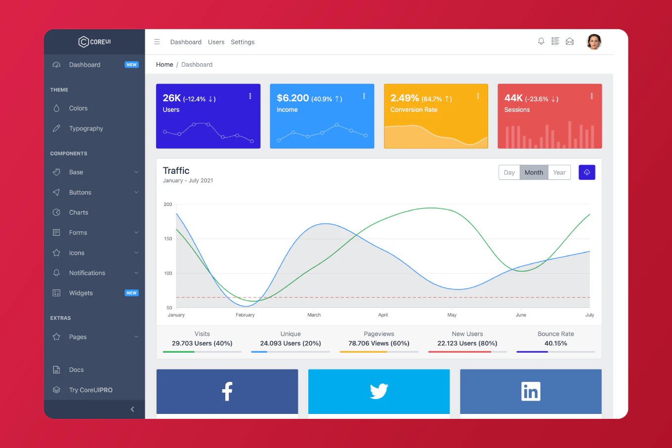
CoreUI 3 is coming in the house… What does it mean? Quality improvement, better code density, more functionality, speed otimization and last but not least – layout which goes in hand with modern standards. So here it goes with our logo. We didn’t want to erase our old logo, beacuse we believe that hexagon is that optimum, which describes our values. What we did with our logo, was the need to refresh it and make both logo and other visuals, clean and uncluttered. We know from you, that you’re satisfied with our minimalist designs, that’s why the idea of refreshing our logo in flat, not 3-dimentional form was quite obvious. On the other hand, we know that people are loyal to brands, not because of their image, but because of what they stand for. And so, rejecting visual gimmickry known from some other brands, we emphasized CoreUI’s authenticity, values and integrity. Logo is the first pillar of our rebranding triada. It represents exactly the same values, authenticity and integrity which can be found on our webpage and in our products. Ready for step two?
Two. Webpage
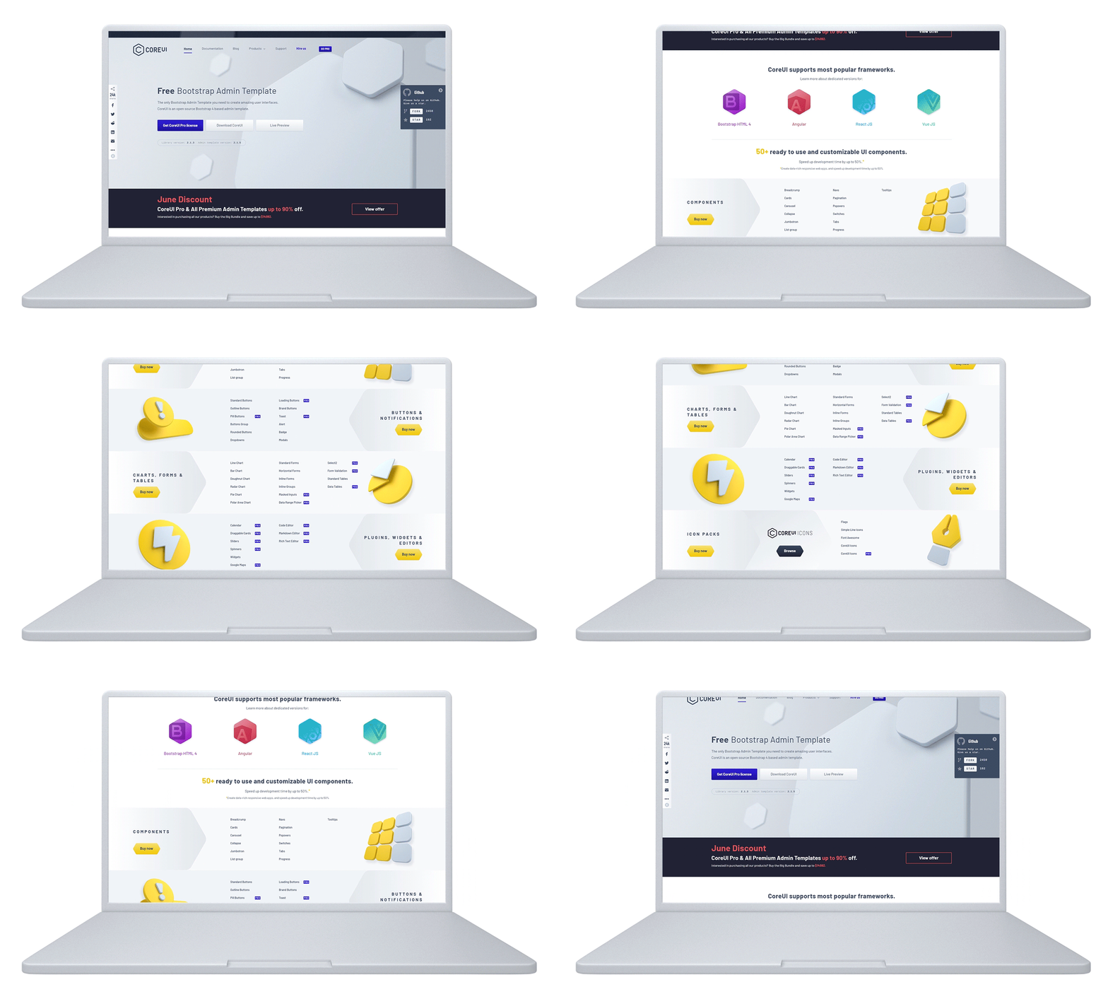
We all agree that rebranding can bring both pros and cons. That’s why before we decided to move forward, we did our due diligence by conducting research to insurance agianst a rebranding debacle. It began with the evaluation of our current brand assets – how was the CoreUI resonating with our customers, prospects and employees. It was a hole in one, cause we had a chance to question our assumptions and examine them against our research findings. CoreUI, as an open source Bootstrap based admin template prepared for Angular, Vue.js and React.js, has been mastered for so many years, that we couldn’t just refresh it. That’s why we took for this job extremely experienced team from Jazzy.pro, who did the magic. It wasn’t easy, but they really did it better than expected – as they said „New logotype and a lot of assets prepared for new webpage was an amazing experience”. During all these years we did our best to equip you with the best products. That was the best way to reach several thousands of customers worldwide. Among them developers, startups and big guys working from military, finntech, gaming and so on. But as it’s been said in the beginning, everything changes over time and when it does, webpage is also something which needs an upgrade. New CoreUI page represents proffesion and potential which our team is to offer you. Eager to get more?
Three. Products
Rebranding isn’t just about changing graphic designs - it’s rather about making inner transformation outwardly tangible. When we decided to rebrand our logo, webpage and products, we didn’t forget that we need to be true to our company’s identity and make it all about the customers we want to serve. It was the only chance to tell you the story of who we have become.
Apart from CoreUI we’ve mastered a set of outstanding CoreUI Icons, which go in hand with our logo and webpage design. Not only the webpage but also an app interface means nothing if it’s not glued with sexy set of icons. CoreUI Icons is a set of more than 2k icons available in the most popular formats like SVG, PSD, Webfront and PNG. They are available in solid and linear styles and if it’s not enough, you can choose any of more than 1k duo-tone icons. It’s worth to highlight that more than 522 of these icons are available completely for free. Both free and the rest of them are constantly developed which will enable us to offer one of the biggest and most comprhensive set of icons available in the net.
In the meantime, share your thoughts with us, what recent rebranding examples strengthened your connection with the brand? Which ones alienated you from the brand? Tell us in the comments below.
