UI Component Libraries: Use or not to use [them] with epic fails and more...
 Łukasz Holeczek
Follow Łukasz Holeczek on GitHub
Connect with Łukasz Holeczek on LinkedIn
Follow Łukasz Holeczek on X (Twitter)
Łukasz Holeczek
Follow Łukasz Holeczek on GitHub
Connect with Łukasz Holeczek on LinkedIn
Follow Łukasz Holeczek on X (Twitter)
![UI Component Libraries: Use or not to use [them] with epic fails and more...](/images/blog/sliders_hu_29b846b5cd3655f4.webp)
In today’s fast-paced world of web and mobile application development, time is of the essence. As such, developers are always looking for ways to speed up their development cycles while maintaining the quality of their applications. One way to do this is by using UI component libraries.
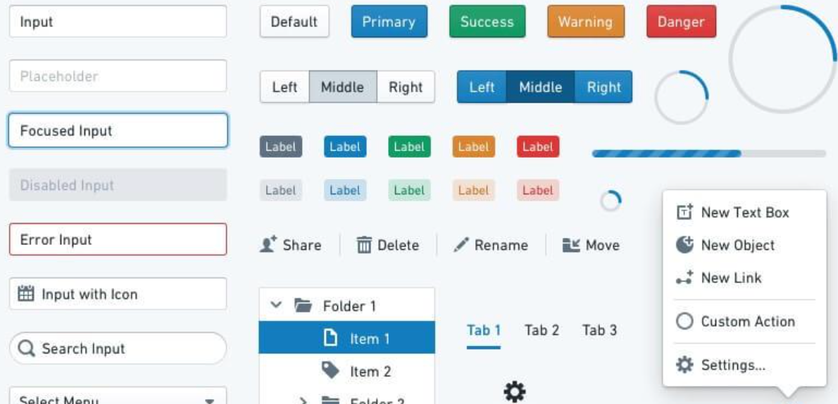
A UI component library is a collection of pre-built user interface elements that can be easily integrated into your application.
Speed up your responsive apps and websites with fully-featured, ready-to-use open-source admin panel templates—free to use and built for efficiency.


These elements can range from basic UI elements like buttons and forms, to more complex visual components, like charts, tables, and calendars. Here are just a few lines of reasons why you should consider using a UI component library in your next project:
Consistency
UI component libraries help ensure consistency in your application’s design. By using pre-built UI elements, you can ensure that every button, form, or other UI element looks and behaves the same way. This can be especially helpful if you have multiple developers working on the same project or if you’re working on a large application with many different UI elements.
Time savings
By using pre-built UI components from a library, you can save a significant amount of development time. Instead of building each UI element from scratch, you can simply integrate the pre-built components into your application. This can help you get your application to market faster and with fewer bugs.

Quality
UI component libraries are often built with best practices in mind (we know something about it, here @ CoreUI), so you can be confident that all the components are well-designed and well-tested. This can help improve the overall quality of your application, as you can be sure that the UI components you’re using are reliable and performant.
Customizability
While UI component libraries provide pre-built components, they also provide a way to customize those core components to fit your app structure specific needs. This can save you time in the long run, as you won’t need to build custom components for every UI element from scratch. You can simply customize the pre-built components to fit your specific use case.
Now, let’s talk about how to integrate a (React) UI component libraries into your project. There are a few different ways you can do this, depending on the specific, custom react components or ui component libraries you’re using and the framework you’re working with. Here are a few examples of how to integrate e.g. CoreUI’s UI component library into your react project below:
Using CoreUI with React
If you’re working with React (component library), you can easily integrate CoreUI’s UI (React) component library using the official React integration for CoreUI package. Simply install the core component package using npm or yarn, and then import the individual components that you want to use in your application. For example, to use the CoreUI Button component in your React application, you can simply import it like this:
import { CButton } from '@coreui/react'
You can then use the <CButton> component in your application just like any other React component. That’s the way React component library saves your time.
Using CoreUI with Angular
Some may ask why we miss semantic ui react components. This Semantic UI React boasts over 100 components and offers the following robust features: Auto-controlled state : Stateful components are auto-controlled; there’s no need to explicitly write code to get the state or the event Shorthand props : Semantic UI React components have a shorthand syntax for passing props.
A prop can translate to so many values. For example, the icon props can be an icon name , an
Docs Material UI React components that implement Google’s Material Design.
Joy UI React components for building your design system. MUI Base Unstyled React components and low-level hooks. MUI System CSS utilities for rapidly laying out custom designs. MUI X Advanced and powerful components for complex use cases.
But let’s skip Semantic UI React library, building blocks, and advanced components or user interface and move towards UI components library Just get ready to use components from the CoreUI Angular package and install the package using npm or yarn. To give you the best example, like with React.js, to use the CoreUI Button component in your Angular application, you can import the CoreUI Buttons module like this:
import { ButtonsModule } from '@coreui/angular'
You can then add the ButtonsModule to your Angular module’s imports array, and use the
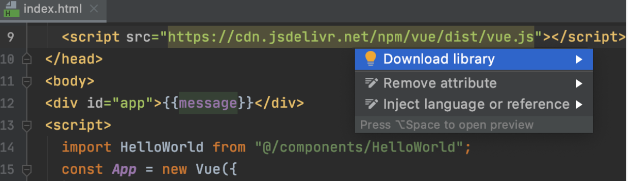
Using CoreUI with Vue
To make a clear… Vue ;) , you can integrate CoreUI’s UI component library using the CoreUI Vue package. Just install the package using npm or yarn, and then import all the components that you want to use in your application. For example, to use the CoreUI Button component in your Vue application, you can import it like this:
import { CButton } from '@coreui/vue'
You can then use the <CButton> component in your application templates just like any other Vue component.
In addition to the <CButton> component, CoreUI’s Vue package includes a variety of other UI components, such as forms, modals, and navigation components. You can find the full list of available components in the CoreUI Vue documentation.
Overall, using a UI component library like CoreUI can help you save time, improve the quality of your application, and ensure consistency in your design. With the ease of integration provided by packages like React CoreUI, CoreUI Angular, and CoreUI Vue, it’s never been easier to incorporate a UI component library into your project.
And now, when we’re ready to roll…
CoreUI provides a variety of UI components for building responsive and modern web applications. Here are the general steps to add CoreUI’s UI components to your project:
Install CoreUI: You can install CoreUI via npm by running the following command in your project directory:
npm install @coreui/coreui
Import CoreUI components: Once you have installed CoreUI, you can import the UI components you need into your project. For example, if you want to use the CoreUI Card component, you can import it like this:
import { CCard, CCardBody, CCardTitle, CCardSubtitle, CCardText } from '@coreui/react'
Use CoreUI components in your project: Once you have imported the CoreUI components you need, you can use them in your project by adding them to your JSX or HTML markup. For example, to use the Card component, you can add the following code to your JSX:
<CCard>
  <CCardBody>
    <CCardTitle>Card title</CCardTitle>
    <CCardSubtitle>Card subtitle</CCardSubtitle>
    <CCardText>
      Some quick example text to build on the card title and make up the bulk of the card's content.
    </CCardText>
  </CCardBody>
</CCard>
Customize CoreUI components: CoreUI provides a variety of customization options for its UI components, such as changing the color scheme or adding custom CSS styles. You can refer to the CoreUI documentation for more information on how to customize the components to fit your project’s needs.
That’s a general overview of how to add CoreUI’s UI components to react app your project. Keep in mind that the exact steps may vary depending on your project setup and the specific CoreUI components you are using in react app your project.

And what about React UI Libraries aka React UI components libraries? React UI libraries are pre-built collections of components and styles that can be used to quickly create user interfaces for web applications using the React JavaScript library. Here are some popular React UI libraries:
- Material UI - A library that implements Google’s Material Design guidelines and provides a wide range of components and styles.
- Ant Design - A UI library with a minimalist design that provides a range of components and styles, and is widely used in Chinese web development.
- Bootstrap - A popular CSS framework that provides a range of components and styles for building responsive web pages, and has a React version called React-Bootstrap.
- Semantic UI - Is a one of the most popular react ui libraries, that provides a range of UI components and styles with an emphasis on human-friendly HTML.
- Tailwind CSS - A utility-first CSS framework that provides a range of pre-defined classes for building responsive and customizable UI components.
- Chakra UI - A component library with a focus on accessibility, ease of use, and customization.
- Materialize - A CSS framework based on Google’s Material Design that provides a range of pre-built components and styles.
These libraries can help you save time and effort in designing and implementing UI components for your web application, and can help ensure consistency and coherence across your app’s user interface.
OK, but which one’s the best react ui component? The “best” React UI component depends on your specific needs and preferences. However, some of the most popular and widely-used aka Best React UI component is:
- Button - Buttons are a fundamental UI component used for triggering actions and interactions with your application.
- Form - Forms are used for data input and are made up of a range of components such as text inputs, checkboxes, radio buttons, and dropdowns.
- Modal - Modals are pop-up windows used to provide users with additional information or actions that can be taken.
- Navigation bar - Navigation bars are used to provide users with a way to navigate through different sections of your application.
- Tab - Tabs are used to display multiple sets of content on the same page, with each tab displaying a different set of content.
- Card - Cards are used to display information in a visually appealing and organized way.
- Tooltip - Tooltips provide users with additional information when hovering over or clicking on an element.
Some popular React UI component libraries like Material UI, Ant Design, and Chakra UI provide a wide range of high-quality components that are easy to use and customize. Ultimately, the best React UI component is one that meets your specific needs and fits with the overall design and functionality of your application.
Designing complex data dense interfaces react applications can be a challenging task, but there are some best practices and approaches that can help:
- Prioritize information hierarchy: Clearly define the information hierarchy and organize the information in a way that makes sense. Use typography, color, and spacing to visually differentiate the different levels of information.
- Use data visualization: Complex data can be made more easily digestible with the use of data visualization techniques such as graphs, charts, and tables. Choose the appropriate visualization method depending on the type of data and the message you want to convey.
- Group related information: Grouping related information together can help make it more easily scannable and understandable. Use borders, backgrounds, and whitespace to visually separate different groups of information.
- Provide filters and search functionality: Complex data sets can be overwhelming, so provide users with the ability to filter and search the data to find what they need.
- Use progressive disclosure: Progressive disclosure is a technique where information is revealed gradually to avoid overwhelming the user with too much information at once. Use this technique to show only the most important information upfront, with the ability to access more detailed information as needed.
- Use tooltips and contextual help: Tooltips and contextual help can provide users with additional information about specific elements or features within the interface, without adding clutter.
Conduct usability testing: Conduct usability testing with representative users to identify pain points and areas for improvement. Iterate on your design based on the feedback you receive to create a more effective and user-friendly interface.
Overall, designing a complex data dense interface requires a user-centered approach, prioritizing information hierarchy, and using appropriate design techniques to make the data more easily digestible and actionable.
Last but not least - a styled system. It is a library for building responsive, themeable user interfaces using a system of reusable design tokens. It provides a set of utility functions that allow you to style your components using a simple and intuitive API.

It uses a “design system” approach to styling, where you define a set of values or “tokens” for various various design elements and properties, such as color, typography, spacing, and layout. These tokens can then be used across your application to ensure consistency in design and user experience.
It provides a set of utility functions that map to these design tokens, allowing you to apply styles to your components in a consistent and reusable way. For example, the color utility function takes a color token as an argument and applies the corresponding color value to the component.
The System also provides responsive styles, which allow you to define styles that change depending on the screen size. This is achieved through the use of breakpoint-specific tokens, which are defined in your design system.
Overall, it’s a powerful tool for building responsive, themeable user interfaces that are consistent and easy to maintain. It provides a flexible and intuitive API for styling components using a system of reusable design tokens, making it an excellent choice for building complex and scalable applications.
- Accessible UI components are essential for ensuring that people with disabilities can use and access your application. Here are some tips for creating fully accessible UI components:
- Use semantic HTML: Use HTML elements that reflect the purpose of the content, such as headings, lists, and buttons, to ensure that assistive technologies can interpret the content correctly.
- Provide alternative text: Use the alt attribute to provide alternative text for images, icons, and other non-text elements, so that screen readers can describe them to users who are visually impaired.
- Use color with care: Avoid using color alone to convey information or meaning, as this can be a problem for users with color blindness or low vision. Instead, use additional cues such as icons or text to convey meaning.
- Use appropriate contrast: Ensure that there is sufficient contrast between text and background colors to make the text easily readable for users with low vision.
- Provide keyboard accessibility: Ensure that all interactive elements, such as buttons and links, are keyboard accessible, so that users who cannot use a mouse can still interact with the interface.
- Ensure focus visibility: Ensure that interactive elements have a clear and visible focus indicator, so that users can easily navigate and interact with the interface using the keyboard.
- Use ARIA attributes: Use ARIA (Accessible Rich Internet Applications) attributes to provide additional information to assistive technologies, such as screen readers, to make the interface more accessible to users with disabilities.
By following these guidelines, you can create fully accessible UI components that can be used by everyone, regardless of their abilities or disabilities. Additionally, you can use tools like axe-core, Lighthouse, or Wave to test and ensure the accessibility of your UI components. And the primitive ui components?
PRIMITIVE COMPONENTS
They are low-level, basic UI building blocks that can be used to create more complex and custom UI components. They typically have a simple and flexible API, and are designed to be composable and easily customizable.
Here are some examples of primitive components:
- Box: A basic layout component that provides a container for other components.
- Text: A component that renders text with customizable styles and typography.
- Button: A basic interactive component that triggers an action when clicked or pressed.
- Input: A component that allows the user to enter text or data.
- Icon: A component that renders icons or vector graphics.
- Image: A component that displays images with customizable styles and dimensions.
- Spacer: A component that adds space and padding between other components.
Primitive components can be combined and styled in different ways to create more complex UI components, such as navigation menus, forms, and cards. By using primitive components, you can create custom UI components that are lightweight, reusable, and easy to maintain. Additionally, many UI component libraries, such as Material UI and Chakra UI, provide a set of primitive components that can be used as building blocks for custom UI components.
MOBILE FIRST?
Mobile-first responsive styles refer to an approach to designing and developing web pages and applications where the various design elements and layout are optimized for smaller mobile devices first and then progressively enhanced for larger devices.
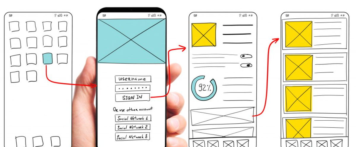
Here are some tips for implementing these styles in individual components (not only) in your next React project:
Start with the smallest screen size: Begin with the smallest screen size that your application will support, typically a smartphone. Design and test your application to work well on that small screen.
Use CSS media queries: Use CSS media queries to specify different styles for different screen sizes. Start with the small screen sizes and progressively add styles for larger screen sizes.
Use relative units: Use relative units such as percentages, em, or rem for font sizes, padding, and margins, instead of fixed pixel values. This allows the layout to adjust and scale to different screen sizes.
Prioritize content: Prioritize content for small screen sizes, such as the most important information, and progressively add more content for larger screen sizes.
Optimize images: Optimize images for different screen sizes, by using responsive images or image compression techniques, to improve page load times on mobile devices.
Test on different devices: Test your application on different devices, such as smartphones, tablets, and desktops, to ensure that it works well and looks good on all screen sizes.
By using mobile-first responsive styles, you can ensure that your application is optimized for mobile devices, which is essential given the increasing use of smartphones and tablets for accessing the internet. Additionally, it helps to ensure that your application is accessible and user-friendly across a wide range of devices and screen sizes.
CONSTRAINT-BASED DESIGN?
Constraint-based design principles are an approach to design that emphasizes the use of constraints to guide the design process. The goal is to create designs that are both aesthetically pleasing and functional, by placing limitations on what is possible and focusing on what is most important. Here are some key principles of constraint-based design:
- Use a grid system: A grid system provides a framework for organizing and aligning design elements. By using a grid system, designers can create layouts that are visually appealing and easy to read.
- Limit the color palette: Limiting the color palette to a few colors can help create a consistent and cohesive design. Using a limited number of colors also makes it easier to establish a visual hierarchy and guide the user’s attention.
- Define font families and sizes: Defining a limited number of font families and sizes can help create a consistent and cohesive design. By using a limited number of fonts, designers can establish a visual hierarchy and guide the user’s attention.
- Prioritize content: Prioritizing content helps ensure that the most important information is presented prominently. By placing constraints on the layout and design, designers can ensure that the most important content is not buried or overlooked.
- Use whitespace effectively: Whitespace is the space between design elements. By using whitespace effectively, designers can create a sense of balance and harmony in the design. It also makes the design easier to read and navigate.
- Consider accessibility: Designers should consider accessibility when creating designs. By placing constraints on the design, designers can ensure that the design is accessible to users with disabilities, such as color blindness or visual impairments.
By using constraint-based, design systems and principles, designers can create designs that are both visually appealing and functional. Constraints help to guide the design process and focus on what is most important, which can lead to more effective and user-friendly designs.
NO RISK NO FUN?
It seems to be easy - let’s create react app? It’s just another javascript library? yes and… not ;) React library? UI component libraries can provide a lot of benefits for web developers, such as faster development, consistency across a project, and pre-built functionality.
However, there are some reasons why you might want to avoid using them:
- Over-reliance on external libraries: When using a UI component library, you are depending on a third-party package to provide critical functionality for your website or application. If the library has any issues, it can cause problems for your project, and you may have to wait for a fix from the library’s maintainers. This can slow down development or cause delays.
- Limited customization: While UI component libraries can save time and effort, they also limit your ability to customize your user interface. You may have to work within the confines of the library’s pre-built components, which could hinder your creativity and limit the unique look and feel of your website or application.
- Learning curve: Depending on the UI component library you choose, there may be a learning curve involved in implementing it. Some libraries may have their own syntax or conventions, and you may need to spend time learning how to use them effectively.
- Bloated code: Many UI component libraries come with a lot of pre-built functionality, which can lead to bloated code if you’re not careful. This can slow down your website or application’s performance and make it harder to maintain in the long run.
In summary, using a UI component library can be a good choice for certain projects, but it’s important to weigh the design system’ pros and cons carefully and choose a library that’s well-maintained, flexible, and meets your project’s specific needs.
UI COMPONENT LIBARIES’ EPIC FAILS
While UI component libraries can be helpful in speeding up development and ensuring consistency, there have been instances where they have caused issues or “epic fails” in projects. Here are some examples:

- Bootstrap 3 glyphicons: In Bootstrap 3, glyphicons were included as part of the default set of icons that could be used in the UI. However, with the release of Bootstrap 4, glyphicons were removed, and many projects that relied on them had to go through a painful migration process to switch to a different icon library.
- Materialize CSS carousel: The Materialize CSS carousel component had a major bug where it caused the page to scroll to the top when the carousel was clicked. This caused significant usability issues and led many developers to seek out alternative carousel libraries.
- jQuery UI datepicker: The jQuery UI datepicker component had a serious accessibility issue where it was not keyboard-friendly, making it difficult or impossible for users who rely on keyboard navigation to use. This issue was eventually fixed, but it caused frustration and extra work for developers who had already implemented the component in their projects.
- Semantic UI’s theme customizer: Semantic UI includes a theme customizer that allows users to customize the look and feel of the UI components. However, this tool was found to have a serious security vulnerability that allowed arbitrary code execution. This issue was fixed, but it highlights the potential risks of relying on third-party UI component libraries that include complex tools and customization options.
In summary, while UI component libraries can be helpful in many ways, it’s important to carefully evaluate their features and functionality before integrating them into your project. Be aware of potential bugs or issues, and stay up-to-date with any updates or changes to the library.
UI COMPONENT LIBRARIES… FOR WHOM?
For those who use react ui framework ;) but let’s leave react developers UI react component libraries can be a good choice for a variety of web developers, depending on their specific needs and preferences. And the best react component libraries? Here are some examples of who might benefit best react component library:
-
Developers who want to speed up development: UI component libraries can provide pre-built components and layouts that can save developers time and effort in building UI from scratch. This can be especially useful for developers who need to build complex UI quickly or work on tight deadlines.
-
evelopers who want to ensure consistency: UI component libraries can provide a consistent set of UI components and styles across a project, which can help ensure a cohesive user experience. This can be especially useful for large projects with multiple developers or for projects where consistency is a priority.
-
Developers who want to improve accessibility: Many UI component libraries are designed with accessibility in mind, providing components that are easy to navigate and use for all users, including those with disabilities. This can be especially useful for developers who need to ensure that their projects meet accessibility guidelines or regulations.
-
Developers who want to stay up-to-date with the latest trends: UI component libraries often include components and styles that are designed according to the latest web design and development trends. This can be useful for developers who want to keep their projects looking fresh and modern.
In general, UI component libraries can be a good choice for developers who want to save time, ensure consistency, improve accessibility, and stay up-to-date with the latest trends. However, it’s important to carefully evaluate each library’s features and functionality to ensure that it meets your specific needs and requirements.
REACT OR VUE?
React and Vue are two popular JavaScript frameworks used for building user interfaces. Both have their own strengths and weaknesses, and similarly, there are many UI component libraries available for each framework.
React UI Component Libraries: React has a wide range of UI component libraries available, including Material UI, Ant Design, Semantic UI, and Bootstrap. These react component libraries provide pre-built components that can be easily integrated into a React application, saving developers time and effort.
Vue UI Component Libraries: Similarly, Vue also has several UI component libraries, including Vuetify, Element UI, Buefy, and Quasar. These libraries provide Vue-specific components that are designed to work seamlessly with Vue, making it easy to build beautiful, responsive user interfaces.
So which one to choose? Ultimately, the choice between a React UI component library and a Vue UI component library comes down to personal preference and the specific requirements of your project.
Both React UI component library and Vue have large and active communities, and both offer excellent options for building high-quality user interfaces. It’s best to evaluate the available options and choose the library that best fits your needs and aligns with your team’s expertise.
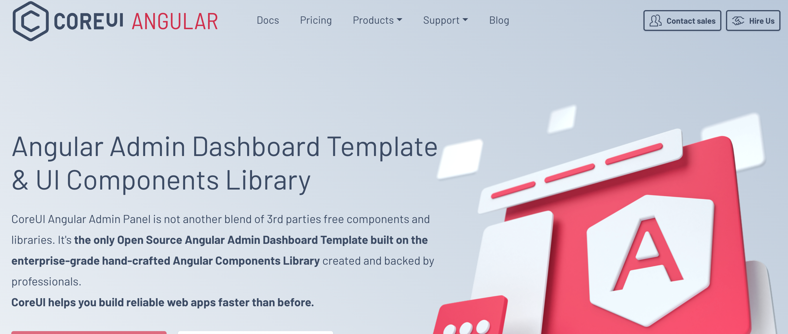
A LIBRARY FROM COREUI?
CoreUI is a UI component library that provides pre-built UI components and layouts that can help speed up web development project, and ensure consistency across a project. Some of the reasons why CoreUI is a good choice for web developers include:
- Customizability: CoreUI provides a range of pre-built components and layouts that are easy to customize to fit your project’s specific needs. You can easily modify colors, typography, and other design elements to match your brand or style.
- Responsiveness: CoreUI components are designed to be fully responsive, ensuring that they look great on any screen size or device. This can save developers time and effort in creating responsive layouts from scratch.
- Accessibility: CoreUI components are designed with accessibility in mind, ensuring that they are easy to navigate and use for all users, including those with disabilities.
- Comprehensive documentation: CoreUI provides comprehensive documentation and support, making it easy to get started and use the library effectively. The documentation includes examples, tutorials, and code snippets that can help developers get up to speed quickly.
- Active development: CoreUI is actively developed and maintained, with regular updates and improvements. This ensures that the library stays up-to-date with the latest web development trends and technologies.
Overall, CoreUI can be a good choice for web developers who want to speed up web development, ensure consistency, and create responsive, accessible UI components for their projects.
Eager to know more? Let us know or comment below.