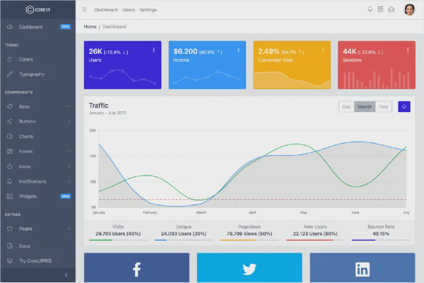
How to build a dashboard in React
Building a dashboard in React requires organizing multiple data visualizations, widgets, and navigation elements into a coherent, responsive interface. With over 10 years of experience building React applications and as the creator of CoreUI, a widely used admin template library, I’ve architected hundreds of dashboards for enterprise applications. From my expertise, the most effective approach is to create a flexible layout system using CSS Grid combined with reusable React components for widgets and data displays. This method provides responsive layouts, maintainable code, and excellent performance.
How to build a responsive layout in Vue
Responsive layouts adapt to different screen sizes and devices, providing optimal viewing experiences from mobile phones to desktop monitors. As the creator of CoreUI, a widely used open-source UI library, I’ve built responsive layouts in Vue applications throughout my 11 years of Vue development. The most effective approach is using CSS Grid and Flexbox with mobile-first media queries in Vue components. This method ensures layouts work across all devices while maintaining clean, maintainable code.
How to create a responsive layout in React
Creating responsive layouts ensures your React applications work seamlessly across all device sizes and screen resolutions. As the creator of CoreUI with 25 years of development experience, I’ve built countless responsive components for enterprise applications. The most effective approach combines CSS Grid for overall layout structure with Flexbox for component-level arrangements. This method provides maximum flexibility while maintaining clean, maintainable code.
How to create a responsive layout in React
Creating responsive layouts in React ensures your applications work seamlessly across all devices, from mobile phones to desktop computers. With over 25 years of experience in software development and as the creator of CoreUI, I’ve built countless responsive interfaces for enterprise applications. The most effective approach is combining CSS Grid for overall layout structure with Flexbox for component alignment and media queries for breakpoint management. This provides flexible, maintainable layouts that adapt automatically to different screen sizes and orientations.


