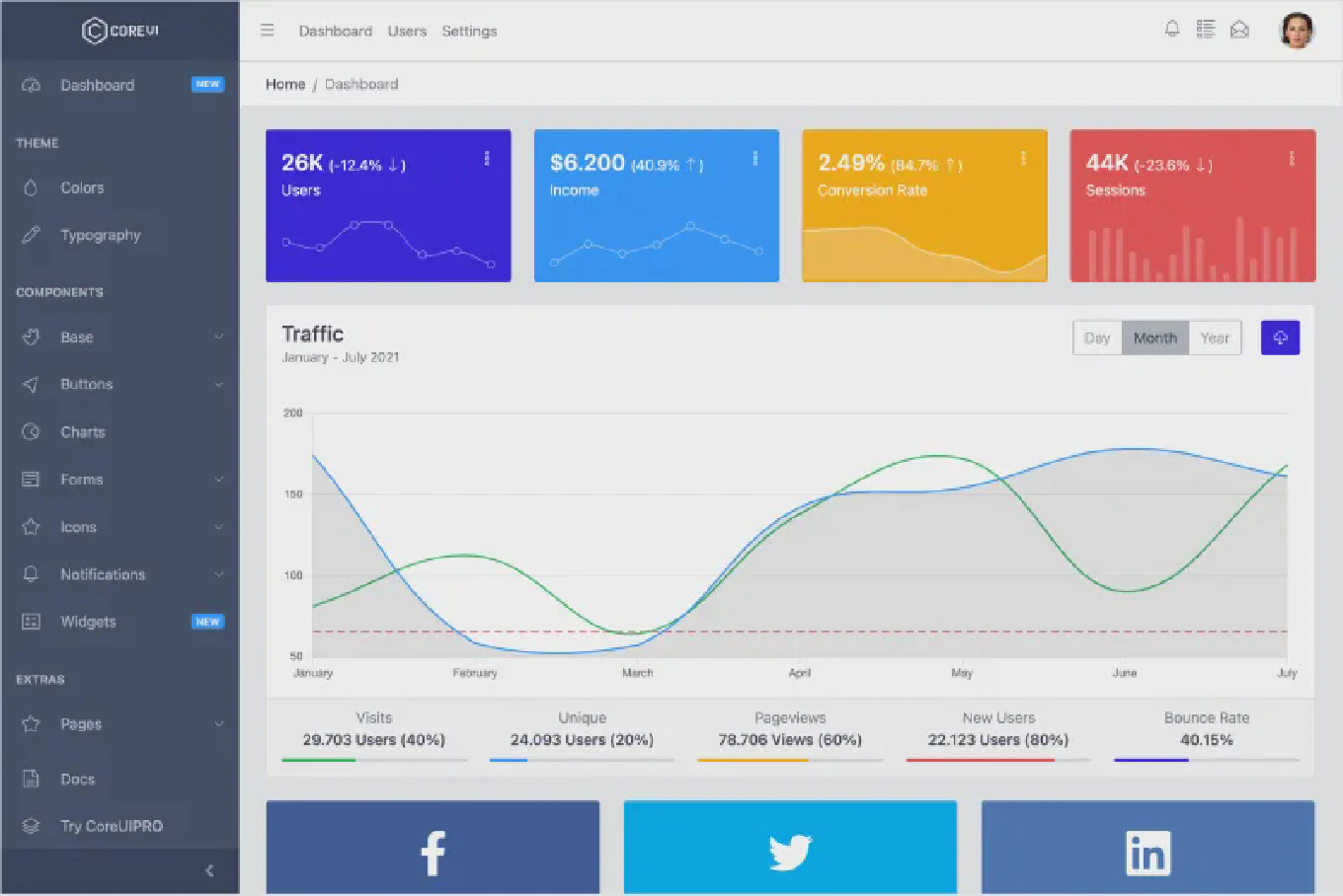
Bootstrap UI Components examples for SaaS back offices
 Łukasz Holeczek
Follow Łukasz Holeczek on GitHub
Connect with Łukasz Holeczek on LinkedIn
Follow Łukasz Holeczek on X (Twitter)
Łukasz Holeczek
Follow Łukasz Holeczek on GitHub
Connect with Łukasz Holeczek on LinkedIn
Follow Łukasz Holeczek on X (Twitter)

Most engineering teams reach for a component library when they realize how much time disappears building the same UI foundations repeatedly. A navigation sidebar, a data table with sorting, a modal with a confirmation prompt — these are not differentiating features, but they consume real engineering hours every time a new project starts. For SaaS back offices in particular, where the surface area of internal tooling is wide and the tolerance for visual inconsistency is low, the right library pays back its adoption cost quickly.
This article walks through practical Bootstrap UI component examples for SaaS back offices and explains where CoreUI fits into that picture — both what it covers and where it reduces implementation friction compared to assembling the same layer from scratch.
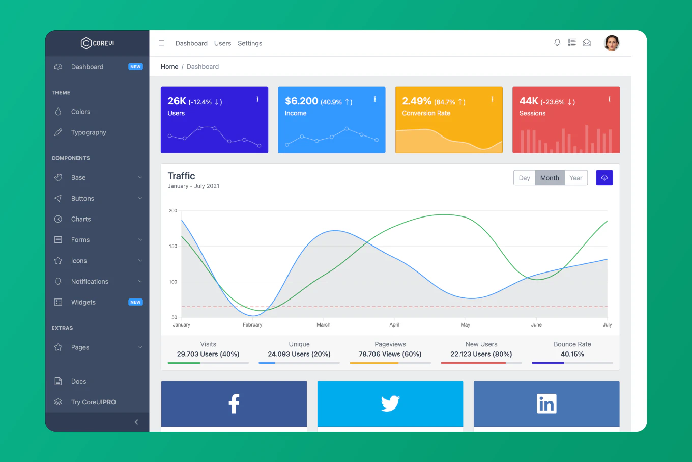
Speed up your responsive apps and websites with fully-featured, ready-to-use open-source admin panel templates—free to use and built for efficiency.
What a component library actually covers in a back office context
A back office is not a marketing site. It is a dense, interactive surface with user management screens, analytics dashboards, configuration panels, data entry forms, and action-heavy tables. The component requirements are correspondingly richer than a public-facing page would demand.
A solid Bootstrap component library for this context needs to cover at minimum:
- Layout primitives — responsive grid, sidebar navigation, collapsible panels
- Data display — sortable and filterable tables, stat cards, charts integration
- Forms — validated inputs, select menus, date pickers, toggle switches
- Feedback and overlays — modal dialogs, toast notifications, progress indicators, alerts
- Navigation — breadcrumbs, tabs, pagination, side navigation trees
- Action surfaces — dropdown menus, button groups, icon buttons with tooltips
When a library covers all of these with consistent styling and documented API patterns, teams can move from project scaffold to a working prototype significantly faster than building each piece from scratch. When it only partially covers the list, the team ends up owning the gap — and that gap typically grows as the product matures.
CoreUI’s Bootstrap component library is built specifically for this surface area. It ships over 50 components tuned for dashboard and admin panel use cases, with Bootstrap 5 as the underlying grid and utility layer.
Where teams use these components in practice
The clearest use cases share a common pattern: high component reuse across many screens, with a small team that cannot afford to rebuild and maintain foundational UI code.
User and account management panels are a near-universal back office pattern. A typical implementation involves a data table of users with row-level actions, a modal for editing account details, a confirmation dialog before destructive operations, and status badges that change based on account state. Building this from scratch with custom CSS means maintaining hover states, focus rings, dark mode compatibility, and responsive breakpoints for every component. Using CoreUI’s table, modal, badge, and button components means the team writes application logic instead of UI plumbing.
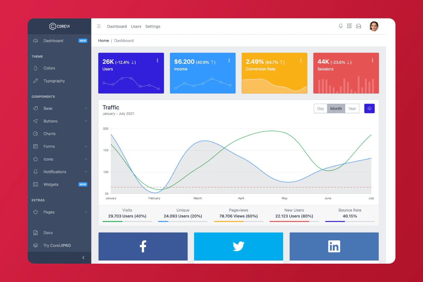
Analytics and reporting dashboards are the other high-density use case. Teams need stat cards, chart wrappers, date range selectors, and layout that holds up at different viewport widths. CoreUI’s Bootstrap admin templates give teams a production-ready starting point that handles the layout decisions a custom build would push to later sprints.
Configuration and settings screens tend to involve long forms with conditional sections, validation state styling, and nested panels. These are expensive to style consistently from scratch because the edge cases multiply. CoreUI’s form components handle disabled states, error states, and accessible labeling without additional configuration.
Feature flag and operations tooling is a growing category in modern SaaS products. These internal tools are built quickly and often maintained by a single developer. A component library reduces the risk that each new tool develops its own visual dialect — a problem that compounds when the team grows and internal tooling multiplies.
Why building the same layer internally carries more cost than it appears
The common argument for avoiding a component library is control — the sense that a custom implementation will be easier to modify and maintain. In practice, that argument underestimates what the library replaces.
When a team builds a modal from scratch, the deliverable is not just the animation and overlay. It is also keyboard trap logic for accessibility, focus restoration on close, scroll lock while open, responsive positioning, an API for triggering it programmatically, and test coverage for each of those behaviors. The same is true for a date picker, a data table with sorting, or a sidebar navigation component with nested links.
Multiplied across the component set a back office requires, that is a substantial amount of foundational work — and it arrives without documentation, without a maintained changelog, and with the full maintenance burden on the team that built it.
A pre-built component library like CoreUI compresses that investment. The components are tested, the patterns are documented, and the upgrade path follows Bootstrap’s own release cycle. For most SaaS teams, the initial cost of adopting CoreUI is lower than the first weeks of writing the same foundations from scratch.
The more concrete tradeoff: custom implementations are faster to adjust in highly specific ways, but slower to reach production quality. Libraries like CoreUI invert that — initial velocity is higher, and customization is handled through theming variables and component overrides rather than rewriting core behavior.
A closer look at modal components in SaaS back offices
Modals are worth calling out specifically because they appear so frequently in back office UIs and because modal implementation quality varies considerably across projects.
A Bootstrap 5 modal needs to handle several overlapping concerns. It should be accessible by default — focus must move into the modal on open, be trapped inside while open, and return to the trigger element on close. It should support multiple sizes (small for confirmations, large for data-heavy forms), optional static backdrops for destructive actions, and programmatic control for cases where the trigger is not a button.
CoreUI’s modal component is built on Bootstrap 5’s modal pattern with CoreUI’s data-attribute system. A standard modal in a CoreUI back office looks like this:
<!-- Trigger -->
<button type="button" class="btn btn-primary" data-coreui-toggle="modal" data-coreui-target="#editUserModal">
  Edit user
</button>

<!-- Modal -->
<div class="modal fade" id="editUserModal" tabindex="-1" aria-labelledby="editUserModalLabel" aria-hidden="true">
  <div class="modal-dialog">
    <div class="modal-content">
      <div class="modal-header">
        <h5 class="modal-title" id="editUserModalLabel">Edit user</h5>
        <button type="button" class="btn-close" data-coreui-dismiss="modal" aria-label="Close"></button>
      </div>
      <div class="modal-body">
        <!-- Form fields here -->
      </div>
      <div class="modal-footer">
        <button type="button" class="btn btn-secondary" data-coreui-dismiss="modal">Cancel</button>
        <button type="button" class="btn btn-primary">Save changes</button>
      </div>
    </div>
  </div>
</div>
The structure is immediately readable to any Bootstrap developer. The data-coreui- attributes mirror the data-bs- pattern, so teams already familiar with Bootstrap 5 do not need to learn a new paradigm. The modal handles focus management and keyboard behavior according to ARIA authoring practices without additional configuration.
For back office contexts specifically, this means every confirmation dialog, edit form, and detail view in the product shares the same modal behavior — same focus handling, same animation, same size variants — because they all use the same component with different content.
Evaluating CoreUI Bootstrap components for your stack
If you are assessing whether CoreUI is the right fit for a SaaS back office build, a few things are worth checking during evaluation:
Component coverage against your screen inventory. Walk your most complex back-office screen through CoreUI’s component list. The alert, pagination, and progress components are representative — if they fit your patterns, the rest of the library will likely follow.
Theming flexibility. CoreUI uses CSS custom properties and SCSS variables for theming. If your product has an established brand system, test how far you can take customization without conflicts. Most teams find the variable system gives enough control for brand alignment without touching component internals.
Bootstrap 5 compatibility. CoreUI is built on Bootstrap 5, which means existing Bootstrap knowledge transfers directly. Teams coming from Bootstrap projects will find the component API familiar while gaining the extended component set CoreUI adds on top.
Documentation depth. The modal component docs and forms documentation are reliable indicators of overall documentation quality. If the examples are practical and the API surface is clearly explained there, that pattern holds across the library.
Where to start
The CoreUI Bootstrap component library documentation is the most direct path from evaluation to implementation. It includes installation instructions, a full component index, and working examples for every component in the library.
If you want to see how the components assemble into a real application shell rather than isolated demos, the Bootstrap admin templates show what a complete back office looks like built on CoreUI — layout, navigation, typical back-office pages, and the component set working together.
SaaS back offices are long-lived products that tend to grow in scope. The component layer decision matters because it either supports that growth or becomes the source of accumulating UI debt. Running CoreUI against your most complex real screen is a more useful evaluation than comparing feature lists in the abstract.