How to choose the right Angular UI Components for enterprise apps
 Łukasz Holeczek
Follow Łukasz Holeczek on GitHub
Connect with Łukasz Holeczek on LinkedIn
Follow Łukasz Holeczek on X (Twitter)
Łukasz Holeczek
Follow Łukasz Holeczek on GitHub
Connect with Łukasz Holeczek on LinkedIn
Follow Łukasz Holeczek on X (Twitter)

Choosing Angular UI components for an enterprise application is one of those decisions that looks straightforward from the outside and turns expensive quickly once a team is six months into delivery. The surface-level comparison — which library has a data table, which one has a date picker — misses the real question: which option reduces implementation cost, keeps the interface consistent as the team grows, and gets working screens into reviewers’ hands faster?
This guide is written for Angular teams doing a genuine evaluation. It covers the criteria that matter most in practice, the mistakes that slow teams down, and the situations where CoreUI Angular components are the practical path forward.
Speed up your responsive apps and websites with fully-featured, ready-to-use open-source admin panel templates—free to use and built for efficiency.
What to evaluate before you look at components
Most teams start a component library evaluation by opening the documentation and scrolling through the component list. That tells you what exists, not what it costs to use. A more useful starting point is a set of operational questions.
How long does it take to implement a real screen? Not a demo. A real screen with a data table, a sidebar navigation, a form with validation, and a header. If the answer requires assembling five separate packages with different styling conventions, that cost compounds across every screen in the application.
How consistent will the interface stay as contributors join? Enterprise applications are built by teams, not individuals. A component library earns its place by making it harder to introduce visual inconsistency than to avoid it. That requires coherent design tokens, predictable component APIs, and documentation that a new developer can follow without asking for help.
What does production readiness actually look like? Accessibility compliance, keyboard navigation, responsive behavior, and ARIA attributes are not features you want to retrofit. They are significantly easier to inherit from a library that already handles them than to add after the interface is built.
How much does onboarding cost? A library with thin documentation might look attractive at evaluation time, but the hidden cost is the senior developer hours spent answering questions that good documentation would have prevented.
The criteria that separate good options from great ones
Angular teams evaluating a component library for an enterprise application should weight these factors above the component count.
Angular-native architecture
Libraries that wrap a jQuery plugin or a framework-agnostic web component in an Angular directive carry structural baggage. They often conflict with Angular’s change detection, create unnecessary DOM dependencies, and make debugging harder. An angular component library built from the ground up uses @Input(), @Output(), Angular services, and RxJS the way Angular intends. That matters for long-term maintainability, not just initial setup.
Design system coherence
Enterprise applications tend to accumulate components over time. A library that treats each component as an independent unit without a shared token layer will drift visually as the application grows. Spacing, typography, color, and elevation should come from a consistent system, not from component-level style overrides that each developer applies differently.
Documentation that covers real use cases
API reference documentation is necessary but not sufficient. Teams building enterprise applications need examples that look like what they are actually building — data-heavy dashboards, multi-step forms, filtered lists, role-based navigation. If the documentation only covers simple examples, the complexity gets handed back to the developer.
Predictable release cadence and Angular version compatibility
Angular updates on a regular schedule. A component library that lags two or three major Angular versions behind puts the team in a difficult position: stay on an older Angular version or maintain a fork. Version compatibility history is a proxy for how seriously a library is maintained.
License and commercial terms
Open source licenses vary in ways that matter for enterprise software. MIT is straightforward. Some licenses introduce conditions around distribution or modification that require legal review before adoption. For teams building commercial or internal enterprise applications, this is worth confirming before going deep on an evaluation.
Common mistakes that make evaluations more expensive
Optimizing for the demo, not the delivery
A component library can look polished in a demo and still be expensive to use in production. The gap often shows up in edge cases: what happens when the data table has 10,000 rows? What does the form validation behavior look like across screen sizes? How does the navigation component behave when the route tree is deeply nested? Evaluation time spent on real scenarios beats time spent on curated examples.
Underweighting operational factors
A handful of missing components is usually a solvable problem. Poor documentation, inconsistent component APIs, and an unmaintained codebase are structural problems that get worse as the project grows. Teams that weight operational factors — support responsiveness, release cadence, documentation quality — tend to make better long-term decisions than teams that focus on the component checklist.
Treating the component library choice as reversible
Swapping out a UI component library in an enterprise application is not a small project. The component library choice affects how developers write code, how designers communicate intent, and how the interface behaves across the application. Teams that treat this decision as easily reversible often underinvest in evaluation and pay for it later.
Skipping the team onboarding test
The developer who evaluates the library is usually not the least experienced person on the team. Running a real onboarding test — asking a developer who has not seen the library before to implement a screen from the documentation — surfaces friction that an experienced evaluator will miss.
Where CoreUI fits in a serious evaluation
CoreUI Angular components are designed for exactly the use case this guide describes: teams building production-quality Angular applications who want a credible shortcut to a consistent, accessible, and maintainable UI foundation.
The library is built natively for Angular. Components use Angular’s standard patterns — @Input() decorators, @Output() emitters, TemplateRef for slot-like content projection, and Angular-compatible form integration. There are no jQuery dependencies or wrapper layers that fight Angular’s rendering model.
The component set covers what enterprise applications actually need: data tables, modals, sidebars, navigation with nested routing, forms with validation states, date pickers, charts, and the full range of layout primitives. These are not toy implementations. The documentation includes realistic examples with enough context to adapt them to production screens.
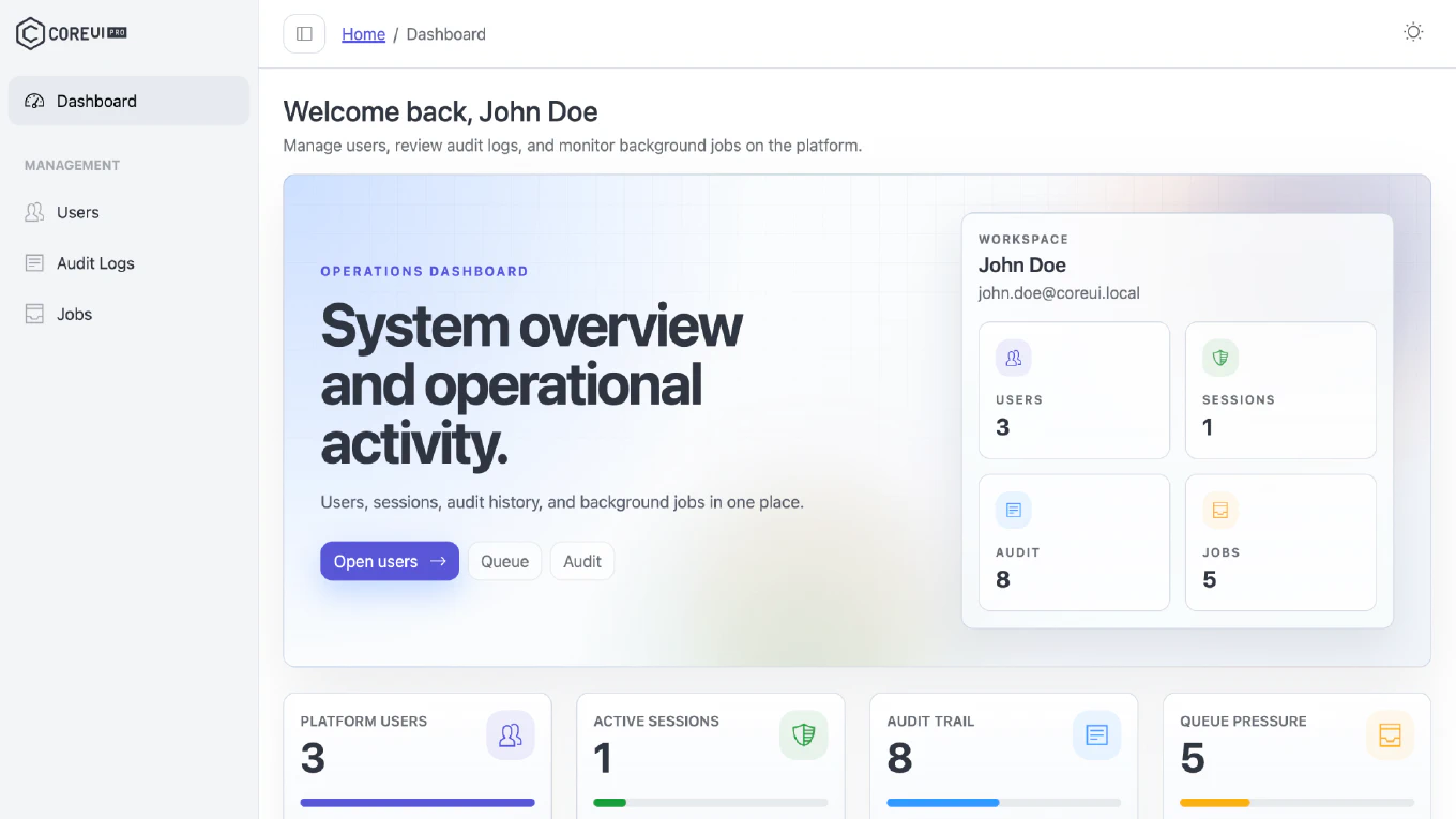
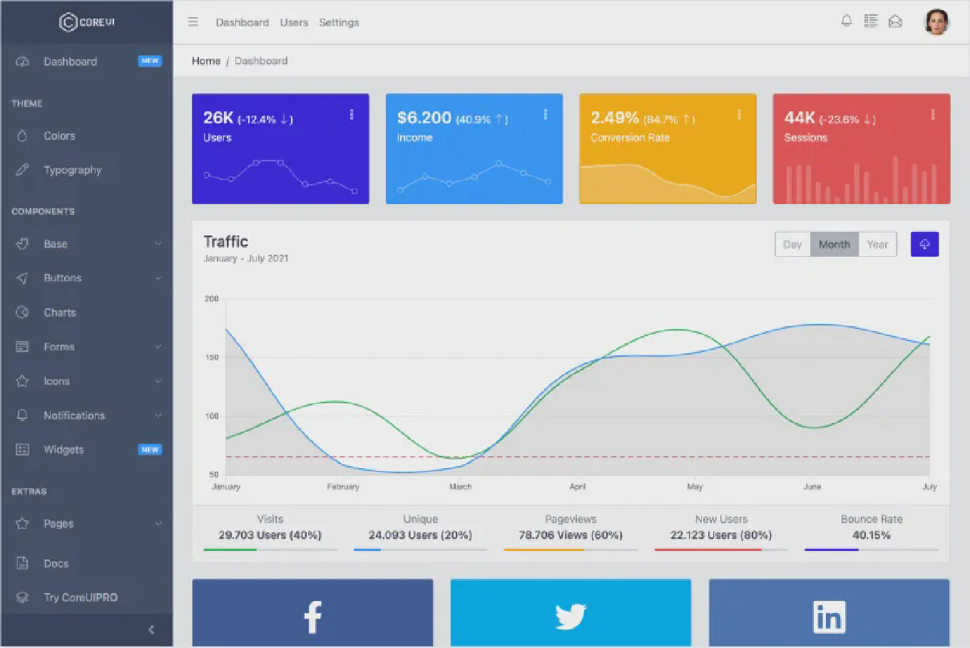
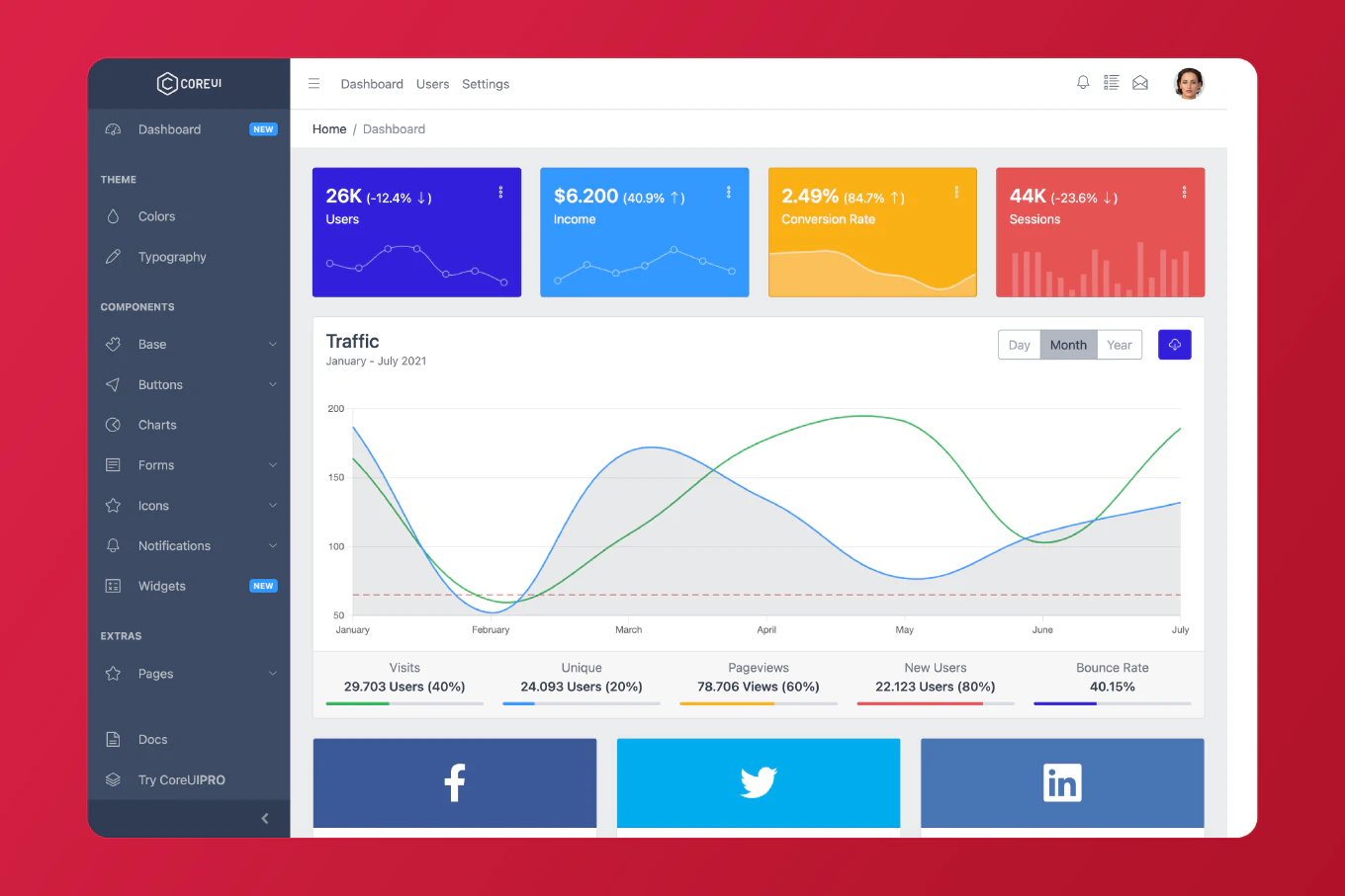
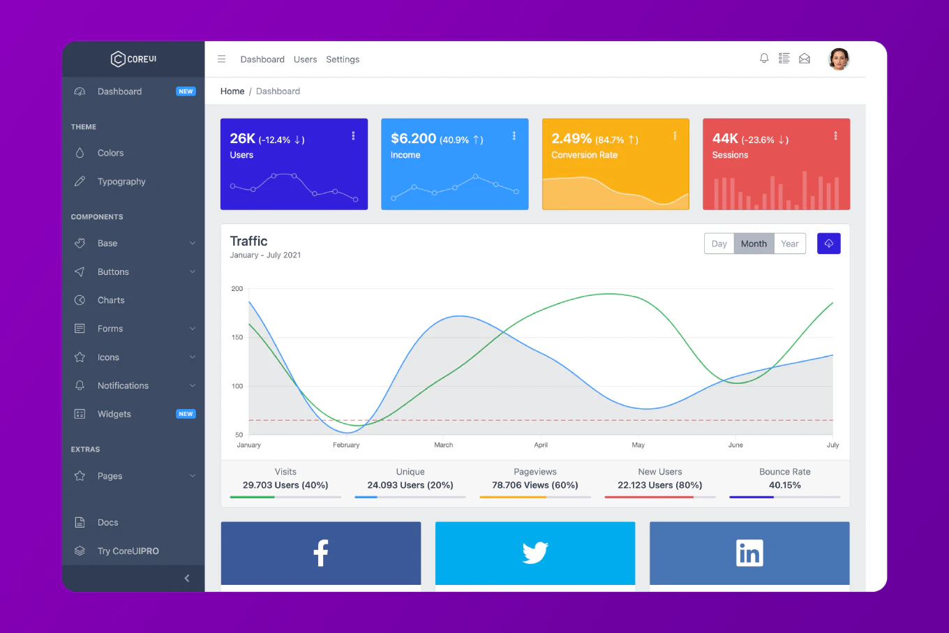
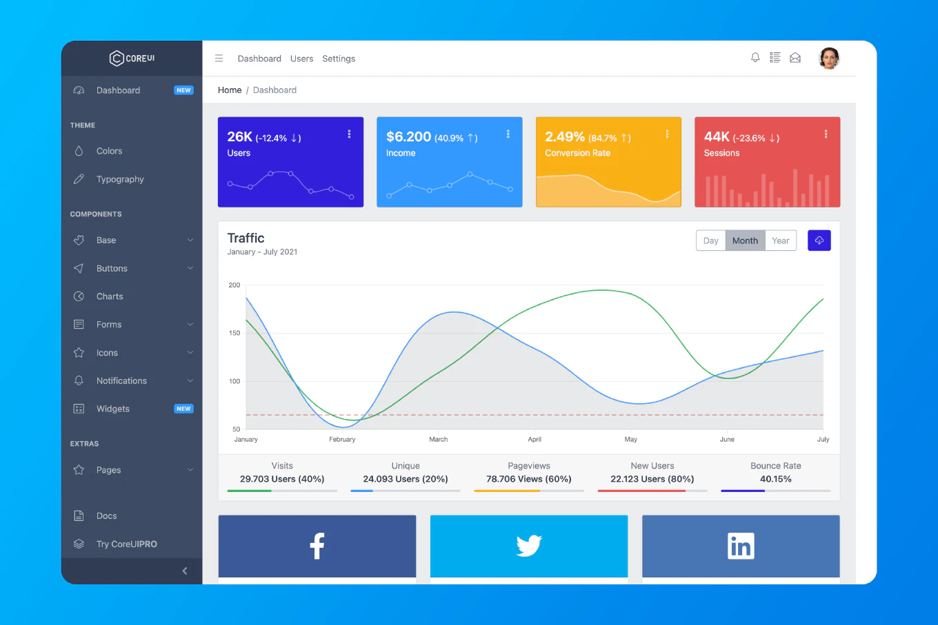
CoreUI is also the foundation for a full admin dashboard template — which means the components are proven in the context of real application layouts, not just in isolation. Teams that want to start from a working dashboard rather than assemble one from scratch have a path that shortens the distance to a reviewable interface significantly.
Accessibility is handled at the component level, not deferred to the application developer. Keyboard navigation, ARIA roles, and screen reader support are built in, which matters for enterprise applications that need to meet WCAG standards or internal accessibility policies.
When CoreUI is the right recommendation
CoreUI tends to be the right choice for teams in a few specific situations.
When time-to-first-screen matters. If the team needs to show a working dashboard to stakeholders in weeks rather than months, starting from CoreUI’s component set and dashboard templates removes a significant amount of setup work.
When the team size is growing. A component library earns more value as the team gets larger, because it becomes the shared language that keeps the interface consistent even as more contributors add features. CoreUI’s design coherence and documentation make it easier for new developers to contribute without breaking existing patterns.
When accessibility compliance is a requirement. Building accessibility into components after the fact is substantially more expensive than inheriting it from a library that handles it correctly from the start.
When the team does not want to maintain a custom component system. Internal component systems are expensive to maintain. They require dedicated engineering time, design alignment work, and documentation investment that could go toward product features instead. CoreUI provides the maintenance investment as part of the product.
It is also worth being direct about fit: if the team has highly specific branding requirements that need deep component-level customization, or if the application requires components that fall well outside a standard admin dashboard scope, those requirements deserve evaluation against what CoreUI provides before committing.
A practical path forward
The best way to evaluate whether CoreUI fits your stack and delivery timeline is to work through the documentation with a real screen in mind — not a contrived demo, but an actual screen from your backlog.
Start at /angular/docs/getting-started/introduction/ and find the components your screen requires. Check the API documentation for the configuration options your use case needs. Look at the examples and assess how much adaptation they require to match your application’s patterns.
If the screen comes together quickly, that is meaningful signal. If it requires workarounds or undocumented configuration, that is also meaningful signal. Real evaluation with a real use case takes a few hours and tells you more than a checklist comparison.
For teams evaluating across frameworks, CoreUI also offers Bootstrap and React versions with the same design foundation — which is relevant if the organization is running multiple frontend stacks or planning a migration.
The decision to invest in a solid component library foundation is one of the few early technical choices that consistently pays off across the delivery lifecycle. Getting it right at the start is significantly less expensive than getting it wrong and finding out at month nine.