CoreUI Data Grid v0.2.0-rc.0 - Infinite Scroll, Cell Selection, Print & Excel Export
Friday, August 7, 2026

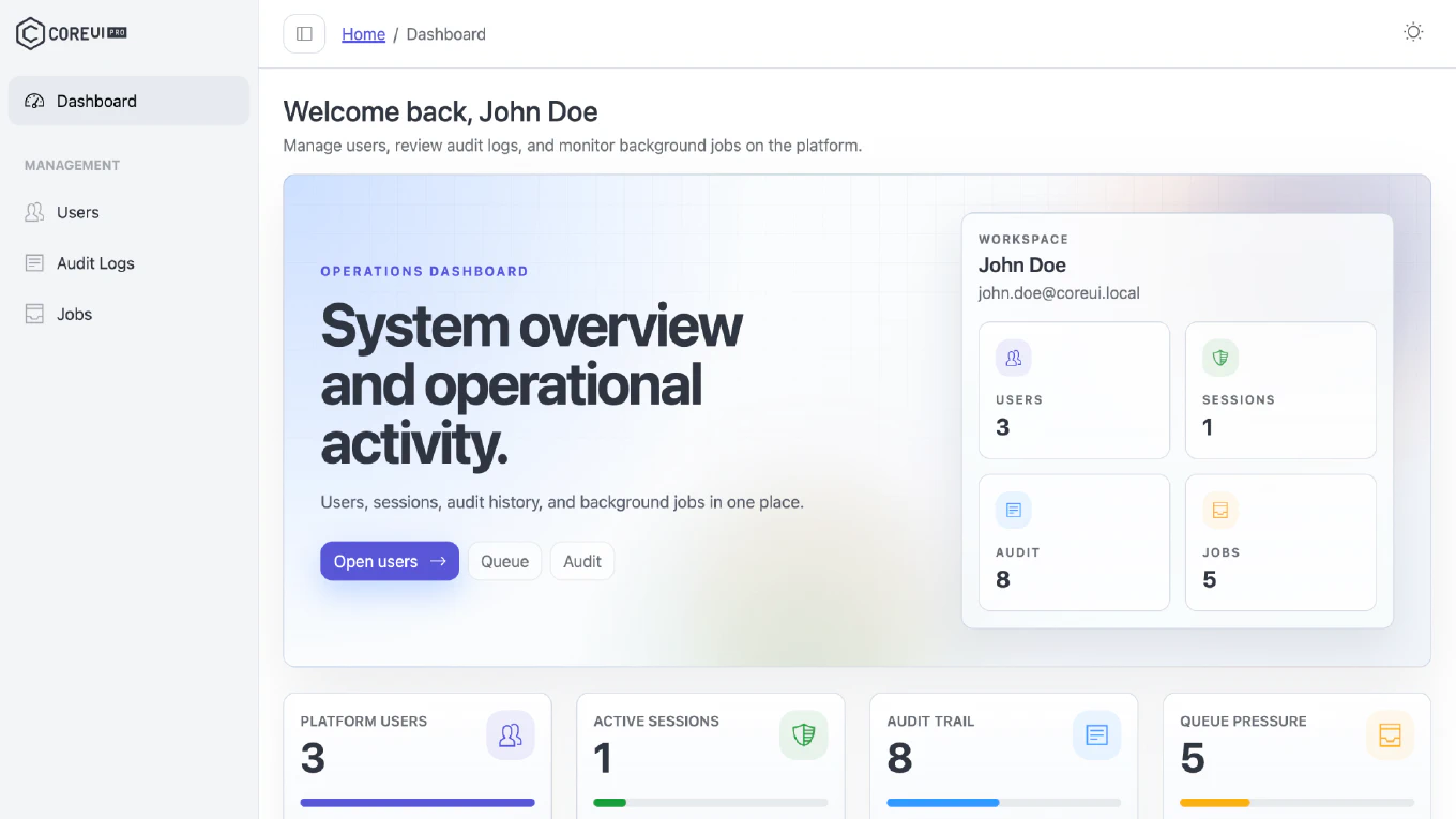
We are excited to announce the release of CoreUI Data Grid v0.2.0-rc.0 - the interaction release. It adds infinite scroll, auto row height, pointer-based drag and drop, row reordering, cell selection with clipboard copy, print, and a dependency-free Excel export. Everything below is available in all four editions - JavaScript, React, Vue, and Angular.
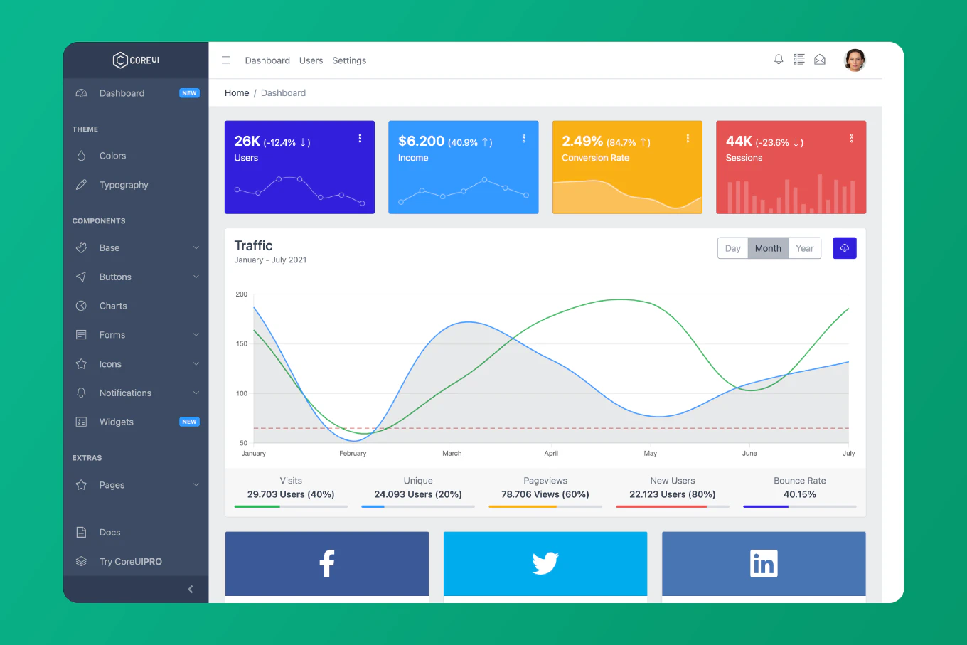
Speed up your responsive apps and websites with fully-featured, ready-to-use open-source admin panel templates—free to use and built for efficiency.
How to Update
Install the package for your framework:
# Vanilla JavaScript
npm install @coreui/[email protected]

# React
npm install @coreui/[email protected]

# Vue
npm install @coreui/[email protected]

# Angular
npm install @coreui/[email protected]
- All editions require the CoreUI stylesheet (
@coreui/coreui-proor@coreui/coreui, version 5 or later) plus the data grid stylesheet shipped with the package. - See the CoreUI Data Grid documentation for the setup steps of your edition.
What’s New
Added
- Infinite scroll (
infiniteScroll): Pages from adataProvideraccumulate in a buffer behind the virtualizer instead of replacing each other, so the user scrolls one continuous list. The next page is requested when the last rendered row comes withinthresholdrows of the end, and the grid stops attotalRows. It cannot be combined withpagination. - Auto row height (
autoRowHeight): Rows are measured by the virtualizer instead of trustingrowHeight, which stays the estimate that sizes the scrollbar. Cells wrap instead of truncating. - Pointer-based drag and drop: Replaces HTML5 drag events for column reordering with a live preview - the columns the dragged one passes slide aside and it slides into the gap - a drag ghost that settles into the slot on release and flies home on Escape, auto-scroll at the viewport edges, and Escape to cancel. It behaves the same with a mouse, a pen, and a finger, and honours
prefers-reduced-motion. Shipped as@coreui/data-grid/drag. - Row reordering (
rowOrder): Adds a drag handle per row. The grid never mutatesitems; it emitsrowOrderChangewith the reordered array plus the moved item and its old and new index, for the app to apply. - Cell selection (
cellSelection): Spreadsheet-style ranges through shift-click, drag, and shift+arrows, with Ctrl/Cmd+A to select everything and Ctrl/Cmd+C to copy the range as tab-separated text ready to paste into a spreadsheet. Values copy as displayed, so the columnformatterruns first. Available as@coreui/data-grid/clipboard. - Print (
toolbar: { print: true },print()): Prints every sorted and filtered row through a generated table, past virtualization and pagination, with an optionalprintTitleheading. Available as@coreui/data-grid/print. - Excel export: A real
.xlsxwriter with typed cells, a bold header row, and column widths, with no runtime dependencies, at@coreui/data-grid/xlsx. It is injected throughtoolbar.export.exporterrather than imported by the grid, so it only reaches an app bundle that asks for it. - Lite bundle entry:
@coreui/data-grid/liteships the grid withdataGridLiteFeaturesas its default set - sorting, filtering, search, and pagination - at ~50 KB gzipped instead of ~61 KB.
Changed
- Reordering swaps on entry. Crossing into a neighbour displaces it at its edge rather than at its midpoint, and the release commits whatever the preview shows.
reorderColumngained an explicitafterargument to express the resulting slot, where HTML5 drag could only insert at the target’s index. - The live reorder preview replaces the
.data-grid-drop-targetclass on the target header cell. cellSelectionFeaturejoins the defaultdataGridFeaturesset, which accounts for ~4 KB gzipped of the release’s growth. A grid that does not select cells can drop it by naming a smaller feature set.
Fixed
- A
heighton the grid element now constrains the scroller. It previously had no path to the viewport, which is sized by--cui-data-grid-viewport-max-height(30rem), so a shorter grid overflowed by the difference. The root is now a flex column and the viewport its flexible child; with no height set, nothing changes. - Dropping a reordered column no longer resets a horizontal scroll. The press that starts a drag focuses the header’s sort button, and tearing a focused element out of the DOM - which the drop’s header re-append does - makes the browser reset the scroller it lived in. A drag now drops focus held inside the grid.
Bundle Size
@coreui/data-gridis ~62 KB gzipped (from ~55 KB), and the lite entry ~52 KB.- The new subpaths stay out of both bundles:
./xlsx~3.2 KB,./drag~3.3 KB,./clipboard~0.9 KB,./print~0.8 KB.
Released Packages
@coreui/[email protected]@coreui/[email protected]@coreui/[email protected]@coreui/[email protected]
Migration Notes
This is a release candidate. After upgrading:
- Install the updated package for your edition.
- If you style the drop target yourself, note that the live reorder preview replaces the
.data-grid-drop-targetclass on the target header cell. - If you call
reorderColumndirectly, review the newafterargument that expresses the resulting slot. - If bundle size matters more than cell selection, name a smaller feature set instead of the default
dataGridFeatures. - Remember that
infiniteScrollandpaginationcannot be combined.
For the full feature list and setup guides for every edition, visit the CoreUI Data Grid documentation.